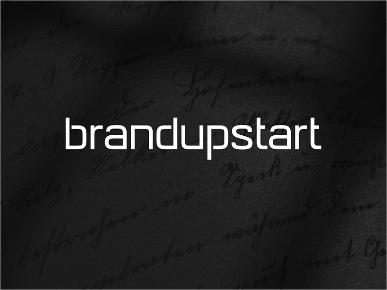
Brand Upstart Identity
Thought I'd include the light version. I think it looks great. Knocking out the bits on the b, d, and p where they connect really works. Such a small thing that really changes the feel of this. Love the font here which was created by Tom at Satori Graphics. If you're not following him, you're missing out on some really excellent design content. Tom knows his stuff and his videos are top-notch.
More by Brand Upstart View profile
Like

