(re)Branding Finesse

Company Stationary

Corporate Presentations
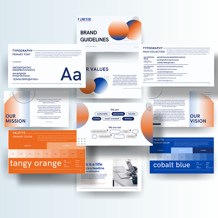
Brand Guidelines
Finesse is an HR consulting firm filled with a team of passionate professionals who believe that people are the heart and soul of any organization. Their mission is to help businesses of all sizes achieve their full potential by optimizing their human resources practices and promoting a culture of excellence.
Finesse believes that creativity is key to creating innovative HR solutions that truly make a difference. Their team of HR experts, designers, and strategists work hand-in-hand to develop customized HR solutions that are tailored to their clients' unique needs and challenges.
Considering the mission statement and the brand values of Finesse, I decided to develop a brand identity that is characterized by a balance of professionalism and creativity.
Finesse's design language should ideally be minimalistic, with a focus on clean lines, empty spaces, and simple typography. The color palette includes attention-grabbing tones of blues and oranges, which convey a sense of stability, trustworthiness, and growth while also projecting a sense of energy & creativity. As per Finesse's request, the design language also incorporates square shapes and clean edges instead of round shapes and curvy elements to reflect their core brand qualities: strength, efficiency, professionalism and practicality.