Professional results on a startup budget.

A cohesive brand identity on a tight budget
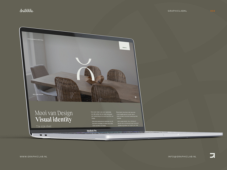
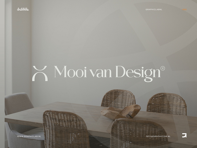
Mooi van Design is a start up company focussing on delivering 3D interior designs for any building or house. They came to us with the challenge of creating a logo and visual identity on a tight budget.
To help Mooi van Design create a strong and recognizable visual identity that accurately reflects the Professionalism, approachability and conviviality that the brand stands for. We wanted to develop a cohesive brand identity that would elevate the company above its competition and effectively communicate its core values to customers.
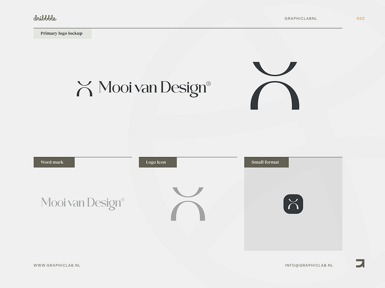
The icon is made up of 2 asymmetrically cut letters “O” which therefore represent the “M” in the negative space, the “V” in the upper arch and the “D” in the lower arch. Combined with the wordmark that is simpler in shape, you get a professional, approachable and cozy appearance.
Next to the logo we've been set out on a journey to make a visual identity which would convey their brand values.
Warm and natural colors combined with a friendly serif typeface will communicate the approachability and conviviality. A pronounced photography style and lean logo style will provide the structure and professionalism that they wanted to achieve.
Let us know what you think! We always welcome our fellow designers to a conversation.
Interested in partnering with us?
Get in touch at [email protected] or visit our website graphiclab.nl.
Follow our updates on: