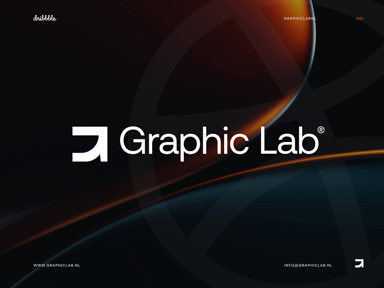
Providing an internationally recognizable style for Graphic Lab
Our logo is how our customers distinguish us from a busy industry. It is a promise of quality, consistency and reliability.
Power. Imagination. Innovation & Growth.
Our logo symbolizes these brand values.
The symbol originated from a fascination for letterforms and design systems. Providing an internationally recognizable style has certainly succeeded in the signage at Schiphol airport. Traveling and trying to tell a story made it a good starting point. The arrows provide a clear direction and visual anchor at the airport.
The letter shapes of the “aurebesh” alphabet from Star Wars give a modern and futuristic look. With this alphabet as inspiration, we looked at a possibility to translate this into the letter G.
With these elements together, it creates a modern and stable icon that speaks of strength, imagination, innovation and growth.
As this is our first post we are curious of your thoughts!
Graphic Lab.
Interested in partnering with us?
Get in touch at [email protected] or visit our website graphiclab.nl.
Follow our updates on:


