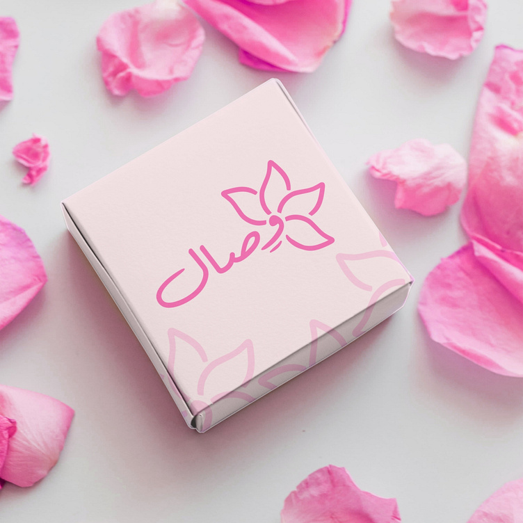
Logo design | "wessal", flower market
Logo design for a flower shop called "Wesal" 🌸
The meaning of the logo is simple and clear. It consists of leaves of a flower surrounding the word Wisal. The letter “Waw” was used and combined with the flower to express its branch or root, indicating that the store is a “root”, that is, the source of all the flowers that you want, you will find them at Wisal. As for the color, the pink color was chosen. bright pink
The calming color of nature often associated with pink flowers
More by Youssef Mizani View profile
Like


