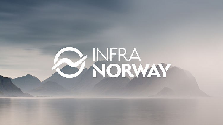
Infra Norway's Renewable Energy
Unlocking the potential of Norway’s Renewable Energy supply. Infra Norway creates the infrastructure and the opportunity in remote locations, providing a platform for data centres, battery technology and green industries to utilise the surplus cheap, sustainable energy - bringing new revenue streams into the local economy, creating jobs, growing communities, and providing a brighter future for everyone.
Infra Norway's mission is to create Net Zero Carbon Energy Parks in locations where there is excess renewable energy supply, providing the brand with plenty of scope for combining meaning and nuance from the business model into the marque itself.
With an electrical bolt also taking the form of a wave, an 'N' and a turbine in conjunction with the ring, the sentiment also has a positive trajectory, providing a sense of growth and development.
The typography, in sympathy with the marque, uses clean geometry with subtle organic flow while mirroring the weight and stencil style ensuring a completely bespoke and balanced design. The overall style ensures a crisp, no-nonsense design with excellent legibility and scope for varied applications.
Aesthetically the creative combines stunning photography, elegantly fluid graphic elements, decisive typography with crisp, clean, and crafted design.
The colours mimic the rich natural beauty of the Norwegian scenery in sympathy with the vibrancy of the local Aurora Borealis. The soothing palette is offset with pops of vibrant light offering many design path opportunities within a cohesive framework.
The result reveals a brand that is serious about sustainable infrastructure and future-focused data systems.


