Brand Development
Montare works with local authorities, landowners and local communities to curate thoughtful developments. With a focus on the pursuit of excellence and attention to detail, there is a sense of craft, space and quality in the creative that reflects the spirit of their business.
With a somewhat Scandinavian feel, the brand uses clean and highly considered typography in conjunction with a muted palette and vibrant highlight accents. There is a sense of modern craft, where every line and texture are carefully considered. How things are presented is just as important as what is printed and the lines of the brand and the marque itself is employed as a structural form, holding images and framing content.
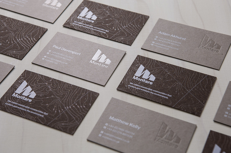
The business cards carry the visual themes and core values through to the physical product. Courtesy of G . F Smith Papers, one side is a Neenah concrete coloured paper that uses 30% post-consumer fibres and sustainable raw materials, while the other Gmund Bier Bock brown is textured with chlorine-free pulp and spent brewers grain. Both papers create a tactility with an environmental tilt, and finished with simple white ink, embossing and a clear foil for the topography and logo.
Flexibility in the visual language allows plenty of room for iteration and varied design as seen across all the collateral. From brochureware to pull-ups, the scope for considered craft is endless.


