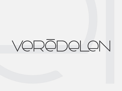
Veredelen Identity design
This brand identity was created for a newly developing design agency. Its history is based from dutch and swiss roots, veredelen meaning to refine, ennoble, and improve. The softening details in the bowls and select terminals reflect the approachability and personality of the agency itself.
More by John Van Orman View profile
Like
