Branding for a marketing agency.

Branding guidelines
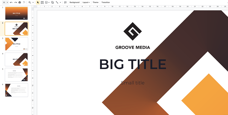
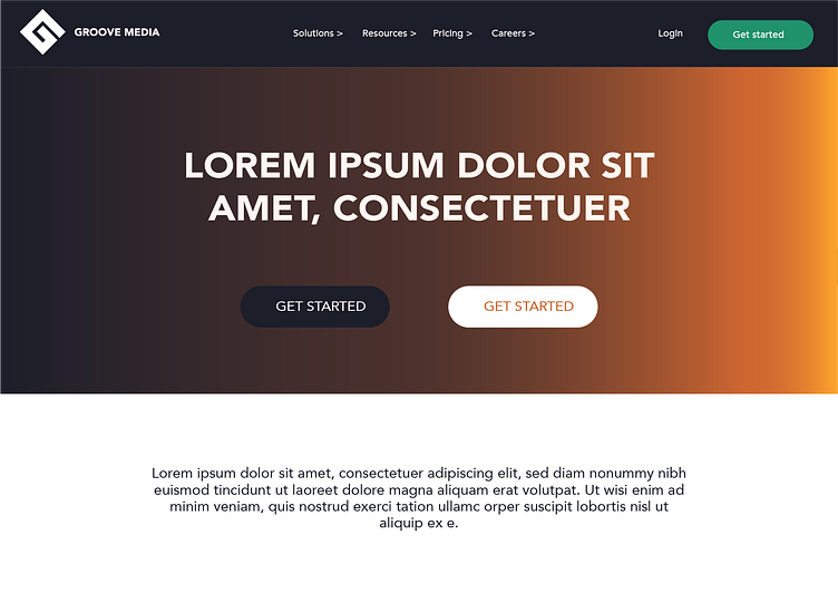
This project included creating the logo, colour chart, presentation templates and a website layout.

Colour design
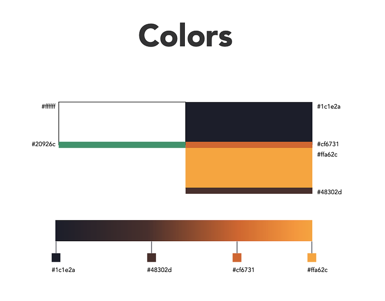
One of my super powers is creating unique colour charts.
Here instead of black I used a subtle dark blue, which gives a bit more luxurious vibe for the brand. In addition to the yellow/orange colors in the logo I wanted to include a highlight colour, which will be used moderately. I chose fresh bright green, which ofc always has a positive tone and brings some nice sharpness to the overall feel.
Thank you for scrolling down and if you like my work, remember to give it a 🧡 .
If you feel like we could work together and create something great, send me an email to [email protected].
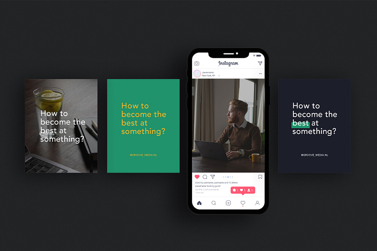
Mockup template used in the 1st picture is from freepik.com