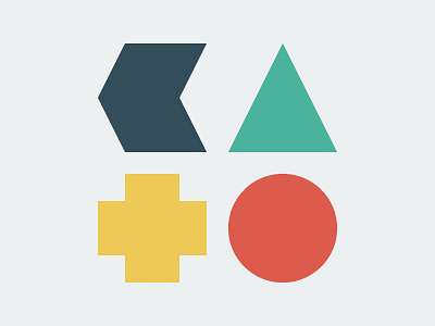
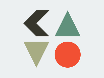
KATO 2.0
Got a lot of feedback regarding my previous version and took it to heart! I like this one a lot better - the K balances with the other letters more, and the T is more T-y.
Feel free to tell me your thoughts - appreciate it!
More by Michael Knepprath View profile
Like

