Logo and brand identity for a logistics company
EXPRESS ROAD | 2022
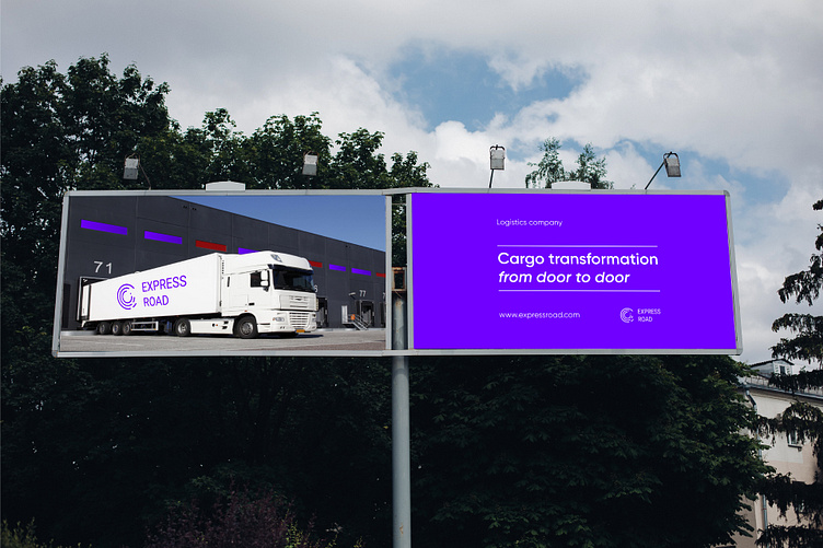
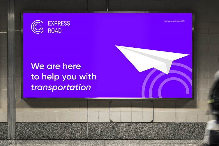
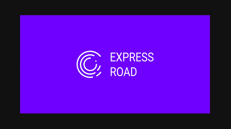
Express Road Company offers comprehensive cargo transportation and delivery services to all regions of America. This visual identification project was conceived in order to bring the strength, seriousness and professionalism needed by a structured company in the market for even greater growth.
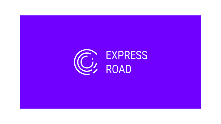
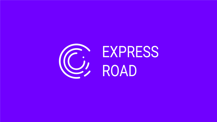
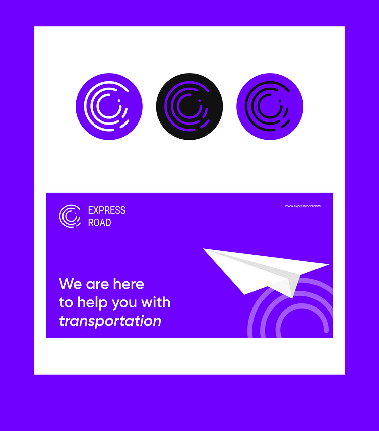
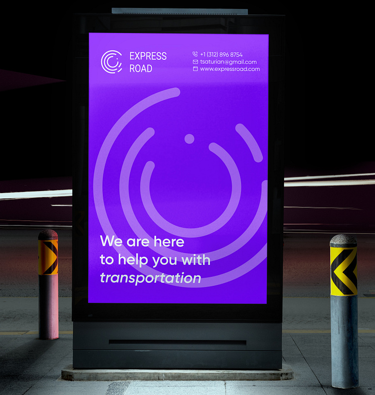
Emphasizing the reliability and safety of the brand, I showed round roads and soft turns in the logo, which means that the trip will go smoothly under any circumstances. This tells us that the transport is of high quality, and the drivers are experienced, this ensures reliable delivery.
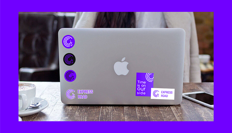
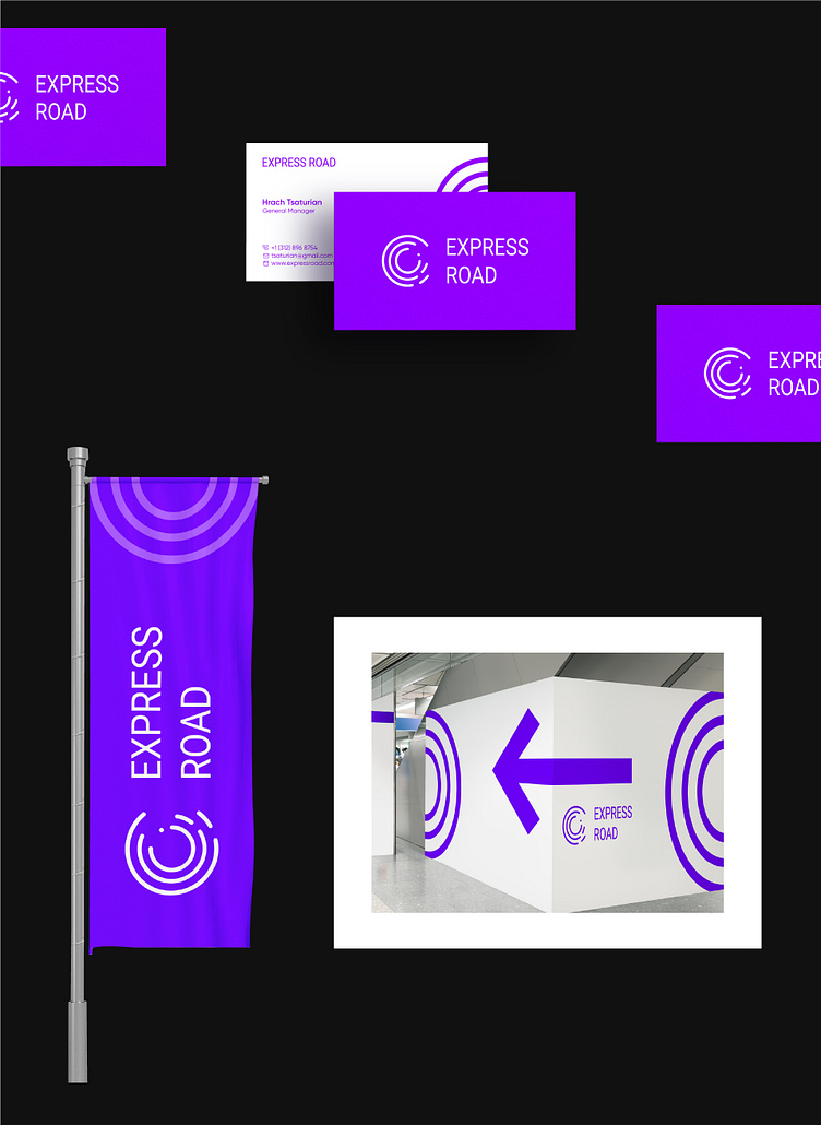
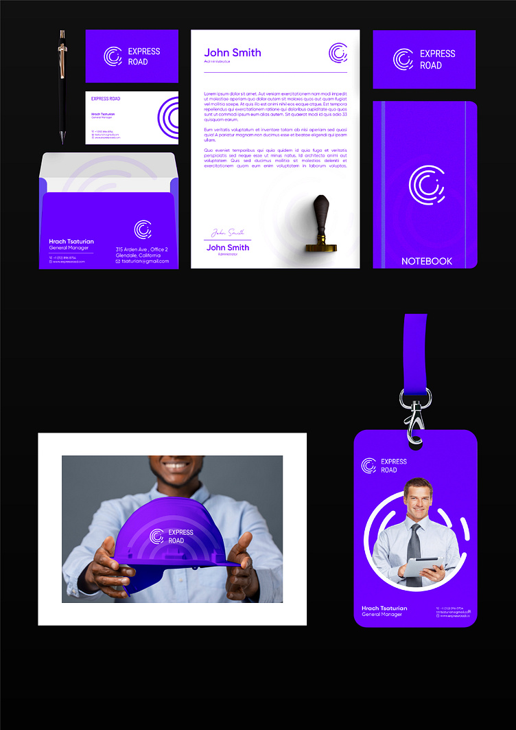
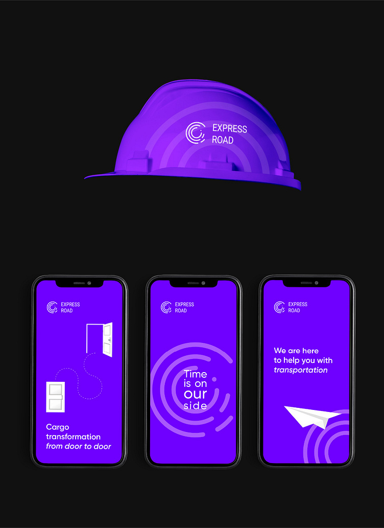
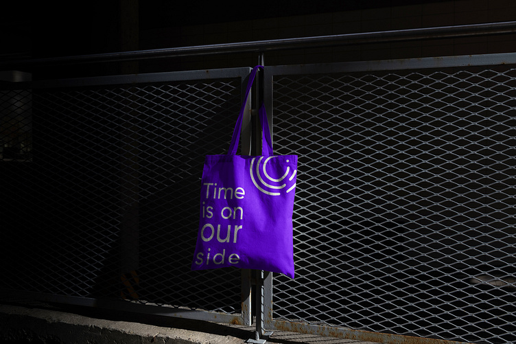
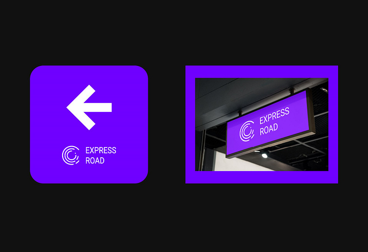
In addition, the shape that I gave to the logo, I began to use separately as corporate graphics to develop an identity, to make it more interesting.
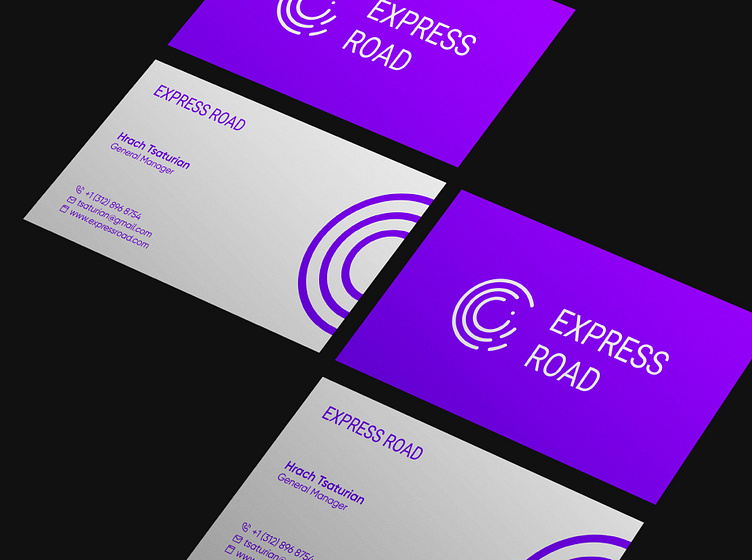
Minimalistic typography gives the letters a solid look without losing the clarity of reading, which corresponds to the concept of fast delivery and ease of maintenance.
Simple, effective, straight to the point.
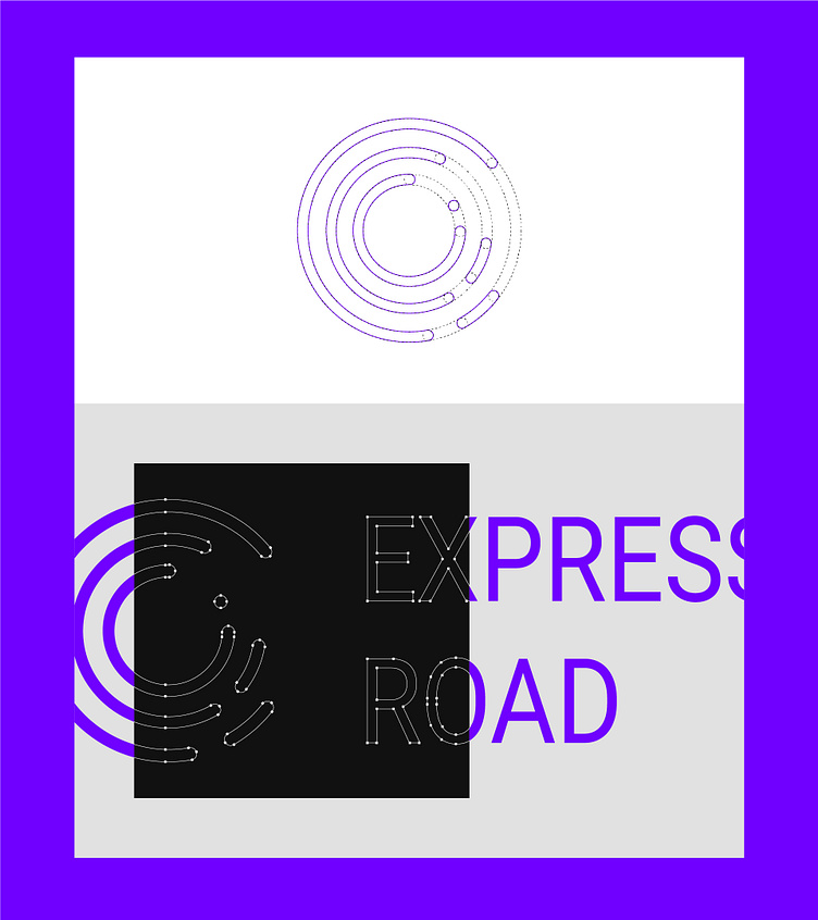
Creation, design and visual character
The logo was designed to convey the speed and confidence that has been embedded in Express Road since its inception. The uppercase font allows the brand to demonstrate strength and safety - characteristics that guide every decision made by Express Road.
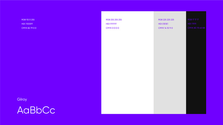
The noble purple became the reference point for the choice of colors. He expresses restrained strength and greatness. It will cause the buyer to respect the company.
The main features of the brand that we highlighted were simplicity, seriousness and efficiency, forming a promising and reliable visual character.

Design by Elena Kalmakova
Write to me to order a DESIGN
Thanks for watching!
Сontacts:
Telegram: kalmakova_elen
