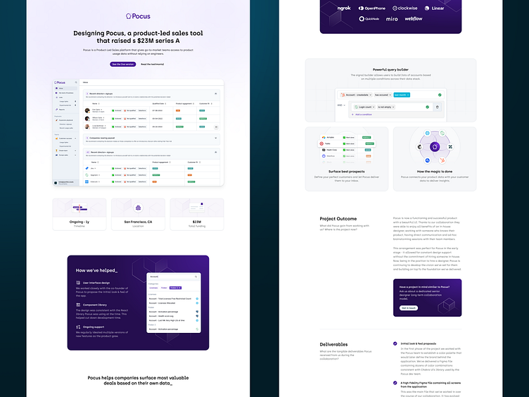
Semiflat - updated case study 🥳
I've shared a design for our new case study page a few days back (see the rebounded shot) but the longer I was looking at it the more I realized it was missing something, so...
I spent the weekend tweaking the page layout. I'd given some extra love to the UI illustrations - my idea is that for every case study we'll draw custom illustrations around the core features of a product we're showcasing.
The main idea behind the new case study is to make the product the main focus. We highlight the outcomes rather than the process, describing tangible benefits and deliverables for every client rather than uploading dozens of visuals. We want the visitors to quickly understand the value we brought to the project and the real life benefits that followed.
If you're looking for a design partner for your next SaaS project, drop us a line, and let's talk about how we can help you achieve your goals.
📬 We're available for new projects. Contact us at [email protected]


