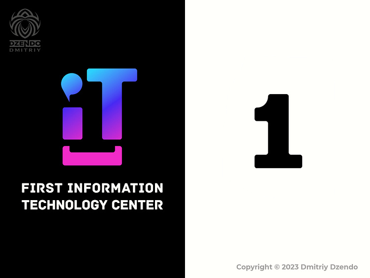
IT company logo
Behind my logo lies a fascinating hidden message. Take a closer look, and you'll see that the two letters "iT" creatively form the number "1" between them in the negative space. But that's not all - the dot above the "i" has a deeper meaning. It represents informative communication, which is at the core of my design philosophy. And at the bottom, you'll find a square bracket, which holds a special significance for programmers who use it in coding. Altogether, these elements come together to form a logo.
More by Dmitriy Dzendo View profile
Like
