Day 8 UI Challenge - 404 Page
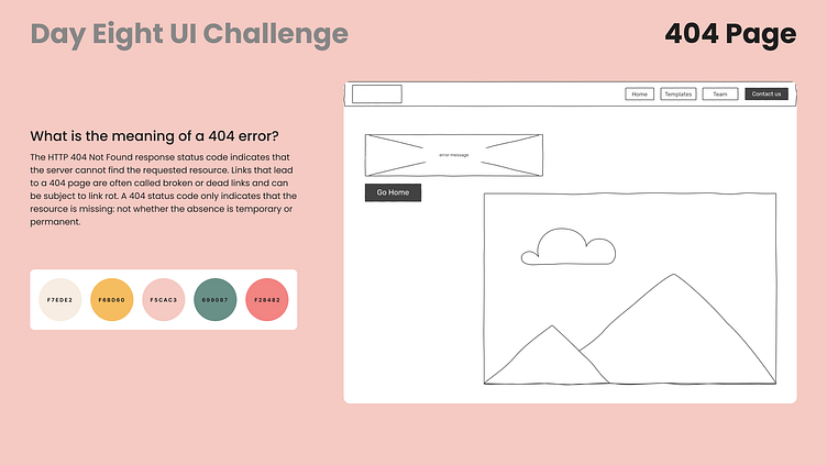
To start this day of the challenge, I spent some time researching 404 pages, and what makes them special to the user.
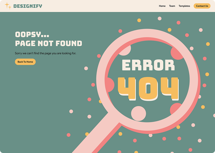
From what I found the best practice is to show the user a way out of the error page easily. With this in mind, I opted to add a button so that the user goes back to the home page.
In the low-fidelity, you can also see that I decided to have the text all in the top left corner so that the user sees the message first, and the illustration second, since they might not know what is the definition of a 404 error.
About the illustration, I focused on the “not found” of the error, and use the magnifying glass as a reference to the action of looking for something.
To add to the challenge I also choose a random color pallet from the website coolors, and made it work with the initial idea.
In the next frame you can the final result, after applying all the previous choices.
Hope you like it, fell free to leave feedback :)