Day 2 : UI Challenge

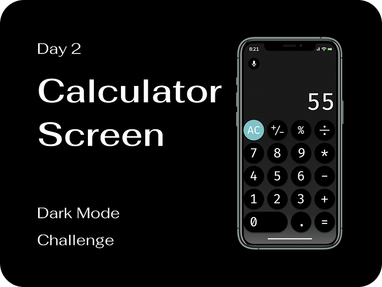
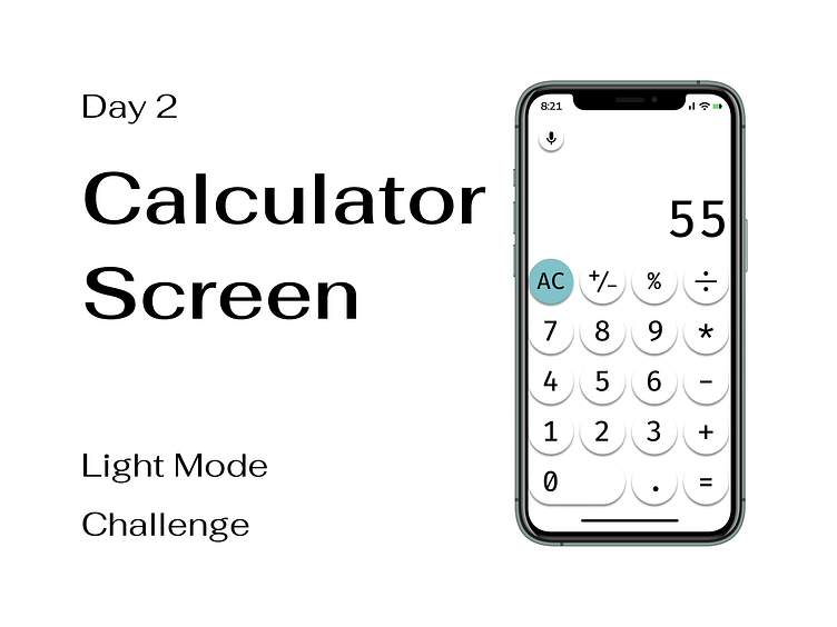
Calculator screen
Similar to the iOS calculator screen, I made the buttons 5% larger with a darker drop shadow and added a blue #80C2C8 to the Clear button.
I also added a microphone option for people who need to use the app but may be on the go, too busy to manually input, or just simply do not feel like typing.