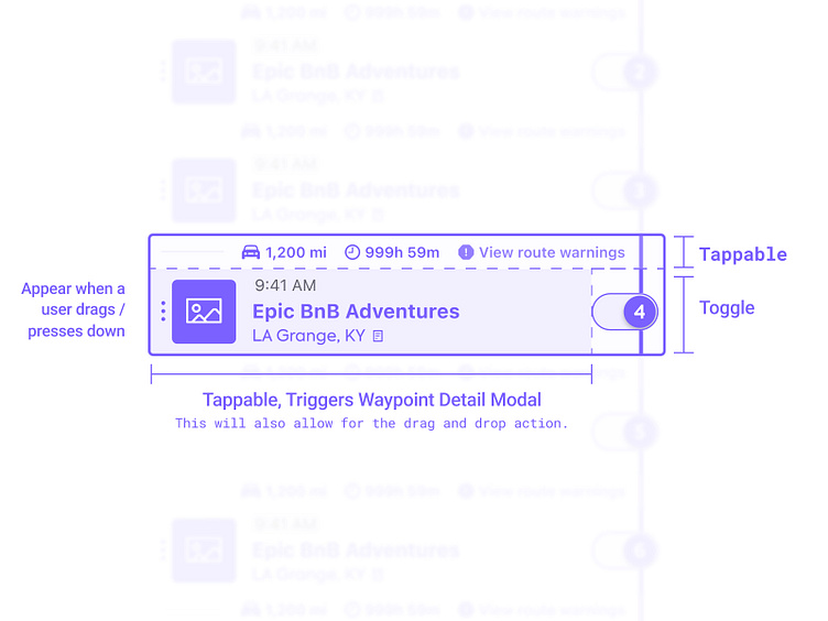
Waypoint Cell Update
I'm excited to share some of the UI designs I worked on last year.
The updates might seem small, but they make a big difference in enhancing the overall user experience.
Every detail has been carefully considered...
For example, ensuring consistent sizing and spacing to maintain a rhythm as you scroll through the trip planner. And let's remember the tricky edge cases I tackled to make the experience more flexible and dynamic. These updates are now starting to roll out, and I'm excited for you to see the improvements for yourself. The foundations we've laid will unlock even more possibilities for the future. Get ready to be amazed! 💻🎨
More by Kyle Kochanek View profile
Like

