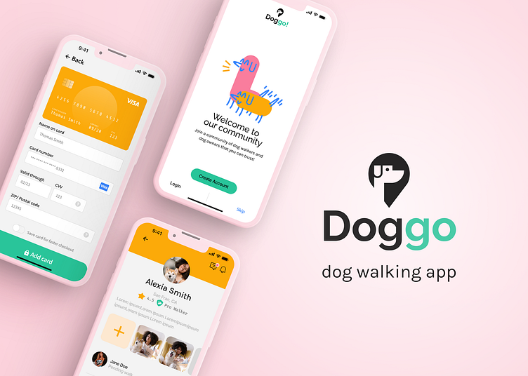
Dog Walking App (UI)
The goal of this project was to create a dog-walking app that solves common user pain points from competitor dog-walking apps. A common complaint was that previous apps were "clunky" and required a lot of effort to use.
My job was to create a user flow that was clear, concise, and effortless. For this project, we focused on the dog owner's flow. See below:
Moreover, trust was a big priority when designing this app, and how trust would be communicated to the dog owner. I chose to use a star system to show the reputation and positive reviews of the dog walker, and a "Pro Walker" badge to identify experience level. Also, the user is not required to put in their payment info until they explore the app and choose a walker first. This builds trust in the app, without overwhelming the user with demands. The user also has the option to skip the onboarding process completely and finish it later if they want.
The user's trust still being a priority here, I created a chat system for the user to contact the walker as well as a GPS system to track their dog during the walk. User's from competitors also suggested a notification for upcoming walks, so I created a pending notification on the profile screen for all future walks.
Thank you for viewing!


