Have another one on me, Chicago.

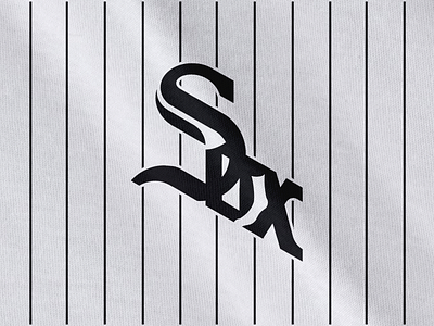
The current Sox logo is a classic, but it's also a mess. It comes across as more of a monogram than a word, to me, and has no real sense of cohesion. So here's my concept.
The current Sox logo is a classic, but it's also a mess. It comes across as more of a monogram than a word, to me, and has no real sense of cohesion. So here's my concept.