Proposal - Door configuration tool


Project
Our customer designs, manufactures, and sells industrial doors and is looking to improve their outdated door calculation program used by vendors all over the world. This is the first proposal of a first idea that we pitched to them.
Goals
The door configuration program already exists, but it is extremely complex and offers a lot of options and very little context. The goal of this proposal is to show the client we can turn something complex in a user-friendly and positive experience.
Role
UX/UI Designer
Team
UX/UI Designer
Art Director
Account Executive
1. Analyses
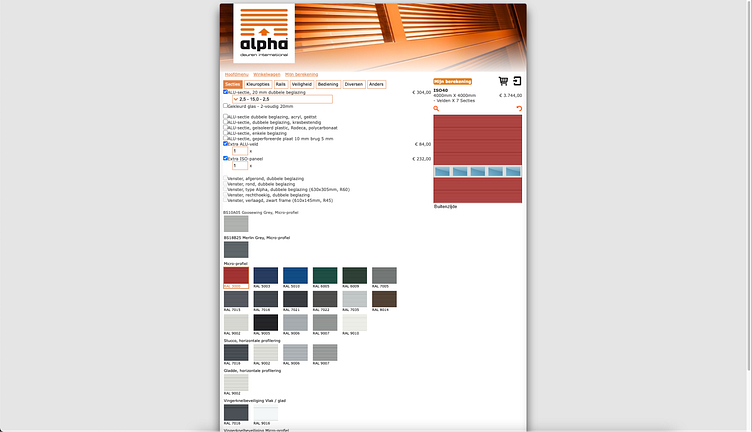
When we have a client that wants us to improve an existing tool, we start by analyzing that tool. What are possible pain points for users? Where can we detect unclarity or missing functionality?
For this tool I discovered the following (most important) issues:
There is no context or additional information for any option;
There is no clear visual preview of what the door will look like;
The tool is outdated, not in the style of the brand, and is not optimized for any screen size.
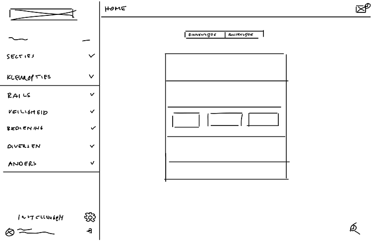
2. Sketching
To start visualizing some layout ideas, I grab either my iPad or sketch directly in Figma by using my pen tablet. These sketches are meant to figure out a rough layout for the main flow which I was going to work on for this proposal.
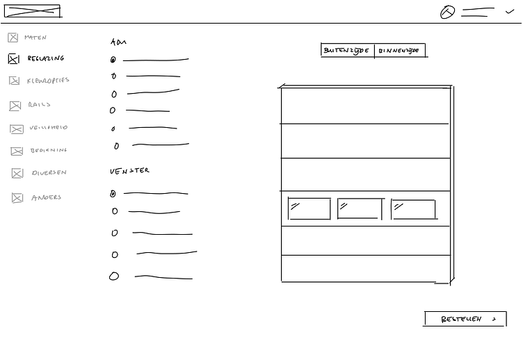
3. Exploration
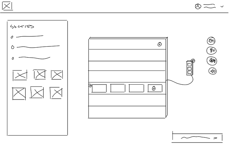
After getting a good idea of the elements that I needed to place on the screens, I started working on a first draft.
One of the earliest ideas that I had was that I wanted the tool to have a much better preview of the door. Instead of having explanations and documentation for every option, it would be much easier to have the preview update real-time while you're selecting options.
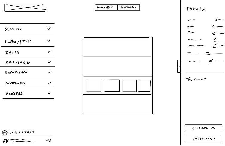
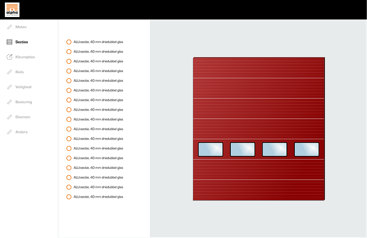
The first exploration shows all the options divided in sections on the left, and a much larger preview of the door on the right side.
4. Design
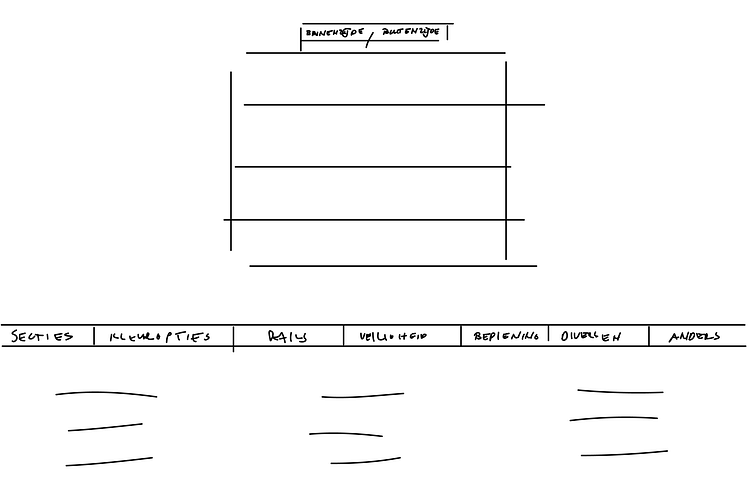
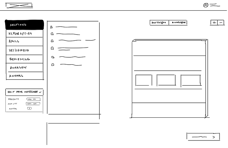
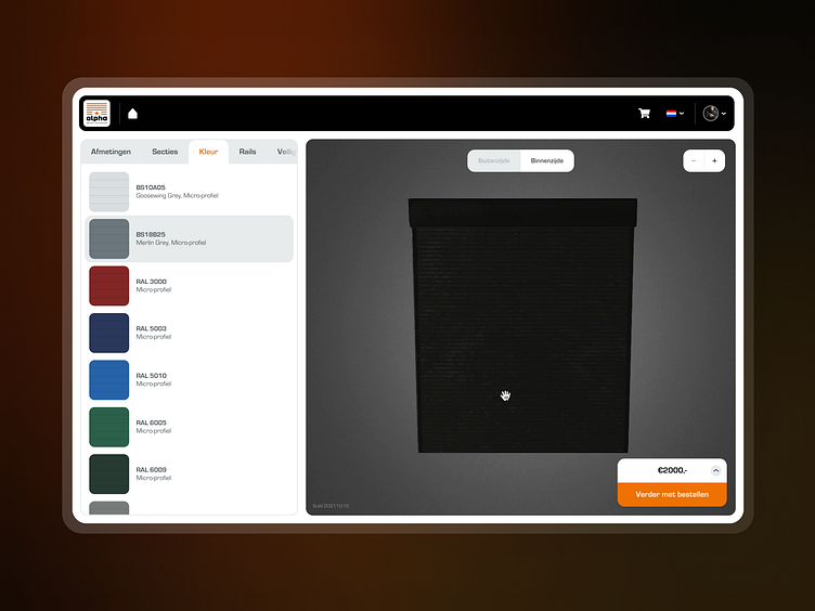
After validating the larger preview on the right side, I worked out my final design. This included working out the top navigation, where users could switch language, sign out of their account, go to the home page and view the shopping cart.
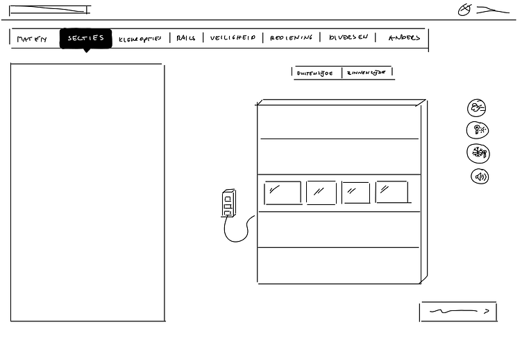
The left sidebar was slightly adjusted to show the tabs/sections at the top to minimize the used space and the options in a more modern design.
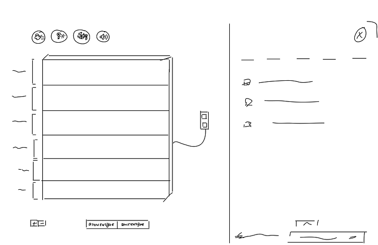
For the preview, I added some functionality, such as the possibility to have a 3D model there. You can use your mouse to pan around the object or use the controller at the top to flip 180 degrees and see the back. I also added some zoom controls to get a better look at the details.
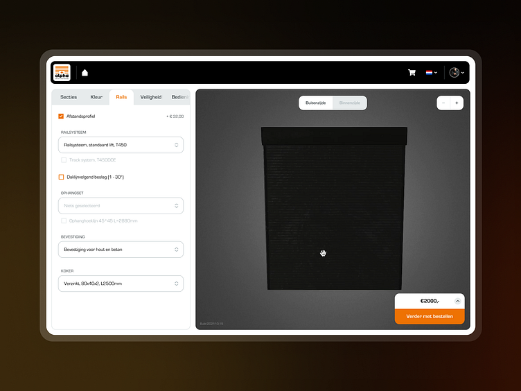
In the bottom right I added the totals section. Here, we would display the subtotals and totals while you are configuring the door. When done, you could use the big orange button to proceed to the checkout.
5. Prototype
The last thing for this proposal was to create a quick prototype. This helps visualizing the flow and interaction.