Underwear brand

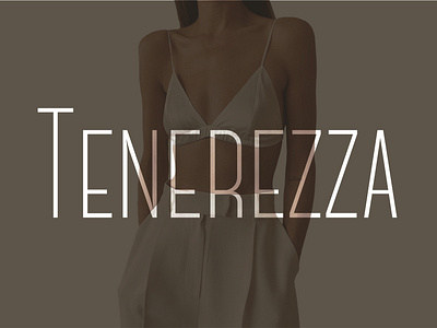
The logo for the Italian underwear brand . It was decided to draw the logo manually. Two are taken as a basis the letters from the store 's name are T and R. With the help of the "curvature pen" tool, serifs were created that emphasize all tenderness and elegance. The outline with the help of "width" was deformed and thickened in some places.
The logo is made in a minimalist style, in the form of a monogram. The main color of the logo is black. It is considered elegant and serious, symbolizing strength, intelligence and luxury. This color scheme focuses on an audience that appreciates sophistication and elegance.
Font used in the store name: Center Light