Horovod

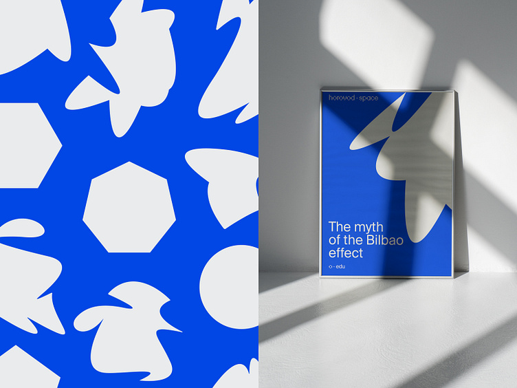
Horovod.Space is an ecosystem for territorial and real estate development offering modern strategies and solutions in marketing, technology, and architecture. To highlight their fresh approach to development, we’ve created a visual language that builds on the meaning behind the brand's name.
The name has a distinct rhythm. It also serves as a metaphor for constant movement, change, and the search for new meanings and forms. To represent this in the brand's graphics, we make a visual comparison between the areas transformed by the company and the dance's invisible internal space.
Learn more about this project!
| ESH gruppa | Instagram | Behance | LinkedIn | Twitter | Pinterest |