Semiflat principles - Layout
I recently spent some time working on Semiflat's internal documentation summarizing all of the principles that we use to deliver consistent interfaces across multiple project teams. I've created a set of example screens to illustrate all of those principles, along with articles going into dos and don'ts, design tips, and the "why" behind the importance of every principle.
More to come 🚀!
How we define it
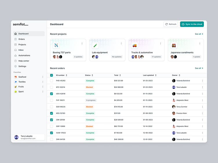
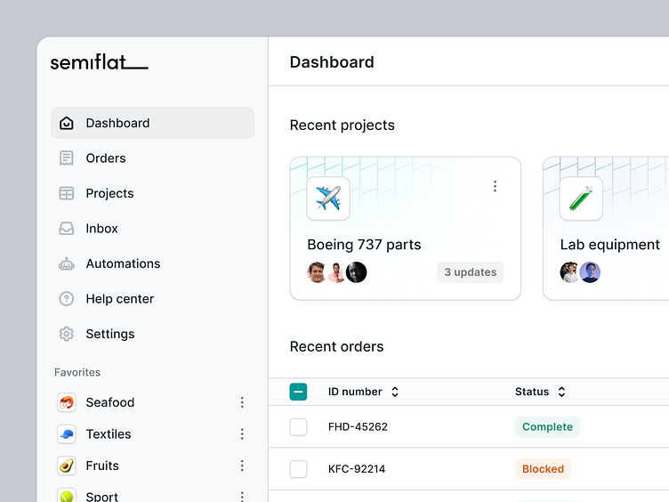
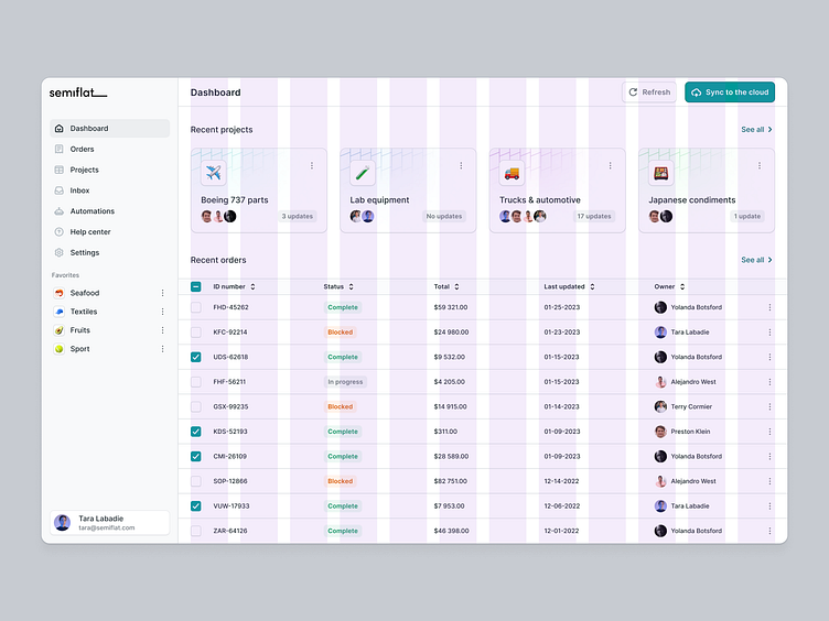
The layout dictates the structure of the interface. It relates to how elements of the interface are displayed. When talking about a layout in SaaS design, we usually mean different, predefined grids that are a part of our internal design system.
Design tips
1. Start with a grid - Use one of our predefined grids from the Starter file that fits your use case. Decide if you’re designing an interface with sidebar navigation or need a layout for an overlay drawer.
2. Leverage layout to guide the user - In western cultures, people are used to scanning content from top left to bottom right. Decide where on the screen you want to place sections or modules of the app based on their importance.
3. Use consistent spacing - Stick to a consistent spacing convention in your design - for example, define the spacing between elements, padding for cards, or spacing between the heading and subtitle as the same value. Make your work easier and build components whenever it makes sense to save time.
Why is it important
Using a grid system is crucial in design handoff as it makes implementing your designs much easier for developers. On top of that, interfaces that follow a cohesive grid system are easier to scan, making it easier for the user to find information efficiently.
If you're looking for a design partner for your next SaaS project, drop us a line, and let's talk about how we can help you achieve your goals.