Logo for a Nutrition Brand
This project was super fun to work on. The client wanted a clean, flat, 2D logo and a wordmark for the nutrition brand specifically catering to the needs of athletes.
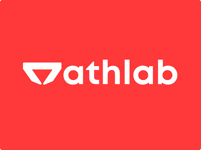
Before even starting the logo design, I went around understanding what do athletes do, how they feel. What kind of exercises do they do. What colors surround them. The name itself has 'ath' & 'lab' in it.Then I took some inspiration from running stances, but it felt too overused by lots of different brands.I looked a little deeper in my research. Almost every athlete keeps running in their training and running as an activity speak to non-athletes too.
So I decided to make a very simple and clean block figure of the starting stance of running. We experimented with typeface, block letters, italics but in the end we liked the simplicity of this font. One more reason to use lowercase was, it helps with kerning where capital A,T,L leave lots of empty space besides them.
Although block letters looked more authoritative & dominant, we wanted the tone of the brand to be more approachable, supportive. Red and white wasn't the original choice of colors. We experimented with shades of blue, grey, turquoise, gradients, etc.
The choice of white and red for the official color of the company made a lot of sense. Black & Red is also the color frequently associated with strength and power. Red is one of the best color for sports as it represents energy and vitality.The logo is also in reverse color scheme, monotones, placed in product mockups for better placement & print understanding.So there you have it :)