Logo redesign project.
This design report covers the entire process of redesigning a logo for the Foo Fighters. It covers the design process from the initial concept and client requirements through research, exploration of ideas, design, and analysis of the finished product.
Initial Concept
This design project started with the goal of redesigning an already existing band logo. Band logos have been around for a long time, and many iconic logo designs fit into this category. Due to their longevity, however, some of them have become dated and found themselves in need of a refresh to make them appeal to more modern audiences.
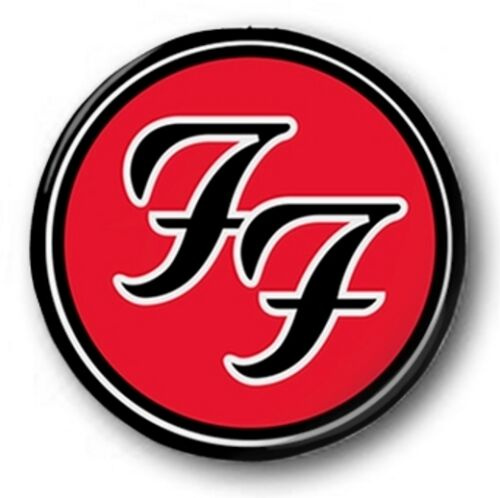
Unlike some of their counterparts, the Foo Fighters’ current logo satisfies many of the basic rules of logo design. It adequately represents the client, is scalable, can be easily reproduced, and works in black and white. The logo, however, appears to be one of those that could do with a more modern take for newer audiences. I also saw the lack of an accompanying wordmark as an opportunity to create one.
Project Requirements
The brief for this design was focused on answering specific questions, including the following:
• Who is the Client?
• What are the objectives of the design?
• What is the scope of the project?
• Who is their competition?
• What is their target audience?
• How will success be measured?
The design process objective was to refresh the image and provide a new "face" for the brand across platforms. During the requirements stage, I came up with some ideas for the direction of the design, as well as its tone and message. As stated earlier, I wanted to create a more modern take on the design, but I also wanted it to remain in line with the band’s theme and style. I wanted to create a simple yet timeless design, combining minimal elements for maximum effect.
Research
The main goal of the research phase was to answer questions established in the requirements phase and gather relevant information to aid the design process, including information about the band, the area of design, inspiration, execution, and mood-board materials.
Target Audience
While the band doesn’t specifically target any demographics, its core audience comprises teenagers and young adults between the ages of 16 and 30. Caucasian males in the given age range account for a higher percentage of their fanbase (roughly 60%).
The majority of Foo Fighters’ fanbase is low to medium-income earners and, more importantly, people with active internet and social media presence because the band likes to promote itself and interact with their audience through platforms like Facebook, Twitter, and its dedicated website (https://www.foofighters.com).
Competition
According to resources such as www.last.fm and music-map.com, bands similar to the Foo Fighters include Green Day, Fallout Boy, Nirvana, Arctic Monkeys, and Red-Hot Chilli Peppers. Some similarities between these bands are their style of music, target audiences, inspirations, and former members.
Summary
In the research phase, I found images from the band and other sources to guide my visual thinking and idea generation. After my research, I wanted to explore combining a word mark and icon that could simultaneously exist independently. I needed the design to have appropriate white space and possibly maintain the double F theme from the original logo.
Idea Exploration
This phase came after the research stage and was the first phase where any physical “designing” occurred. The Idea Exploration stage of this project can be further separated into the Typography Exploration and Icon Exploration phases.
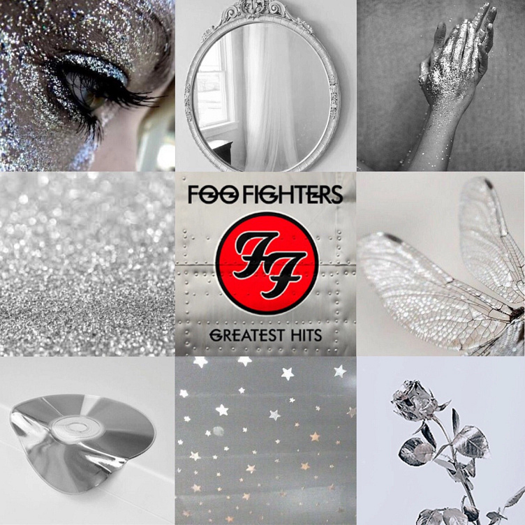
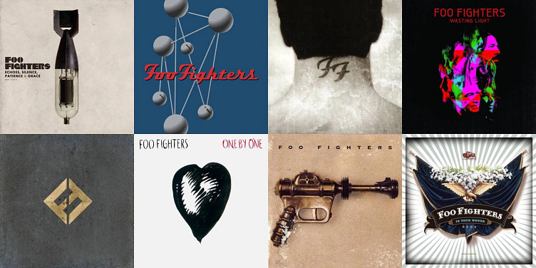
Mood board

Sketches
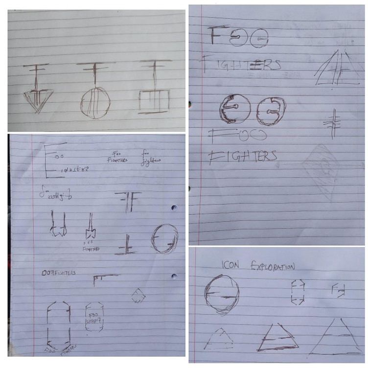
First, I started with low-fidelity hand-drawn sketches of my initial ideas. This enabled me to churn out a handful of decent ideas in a small space of time. By juxtaposing them against one another, I identified what elements worked and didn’t and the ones that could be combined for maximum effect.
Icon Exploration
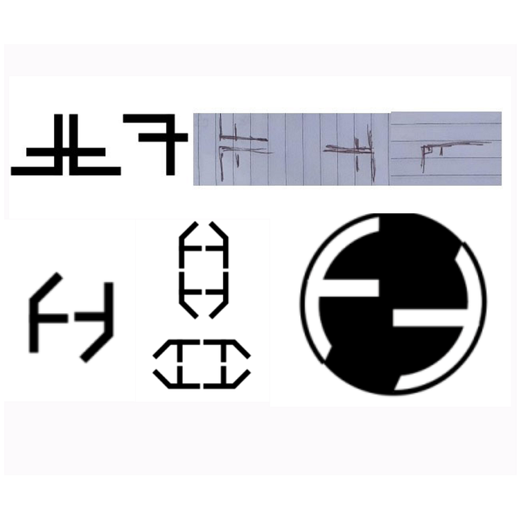
I took the ideas that deserved further exploration into the Adobe Illustrator program and made rudimentary vector renditions. Following research and inspiration, I had a few directions for the logo icon.
First, based on the pistol from the cover of the band’s first album, I explored geometric interpretations of the gun shape and the letter F.
A lot of the band’s core members – especially its founder, David Grohl – were members of previously existing or defunct rock bands, so I also explored a “recycling” theme, based on the recycling logo and the yin-yang symbol.

The band’s name is based on a term used by allied aircraft pilots (during the second world war) for describing unidentified flying objects, so I briefly explored a fighter jet theme.
Next, I explored a musical instrument theme for the icon design. This led to two main instruments – the electric guitar and the bass drums – the two most ubiquitous musical instruments in the band’s music, videos, and photographs.
Typography Exploration
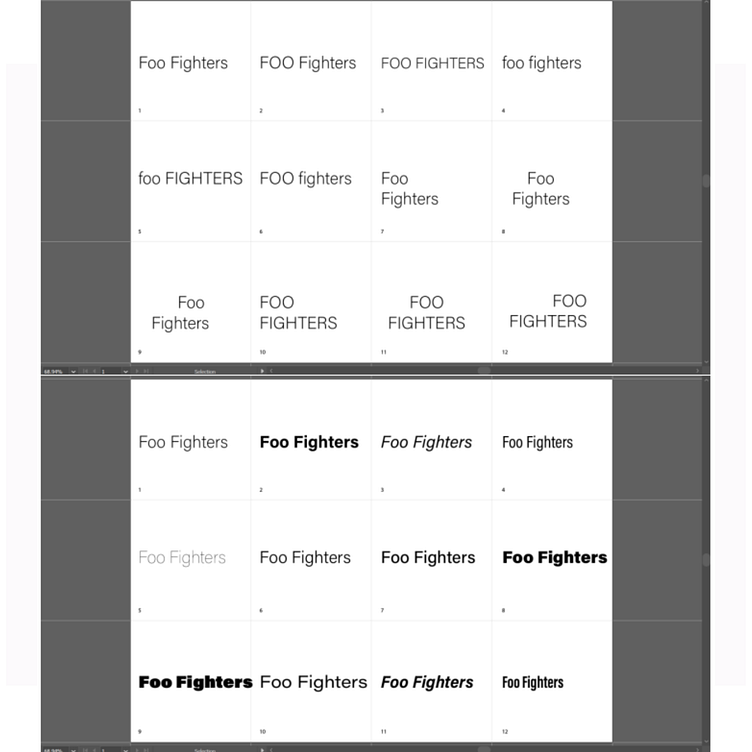
To create the typographic elements of the logo, I began by exploring combinations of different cases, weights, styles, and orientations of text. Using the Acumin Variable Concept typeface – for its variety of styles and options – I tried setting out the band’s name in uppercase, lowercase, and alternating cases to see what relationships worked best. I also explored Google Fonts, DaFont, Font Space, and other free font libraries to find typefaces that best complement the design choices.
Others
OthersI also explored colours and textures for the design – based on the band’s already-existing visuals. The most popular colours were white, blue, red, black, grey, and gold. The most noticeable textures in the band’s previous works were metal and concrete/earthy textures. I was mainly focused on getting the design to work in black and white at this stage, so I kept it to a minimum.
Refining the Design
I went through different iterations of the final design, refining the dimensions and typography to arrive at the desired outcome.
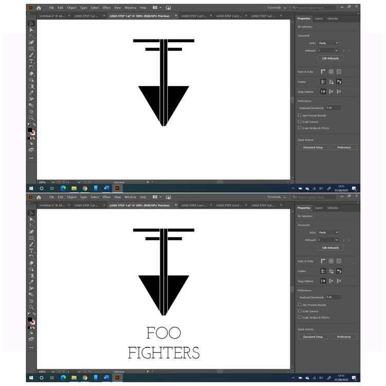
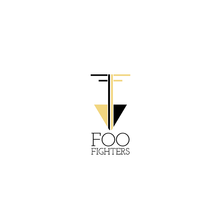
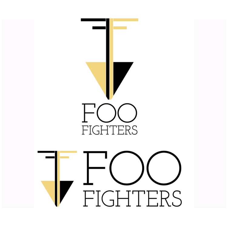
• I chose the musical instrument theme for my final design – specifically the electric guitar – and incorporated the double F design through negative space.
• I kept the use of colour to a minimum, but I used a shade of gold (#F2D680) to create a “concrete and gold” theme, echoing the title of the band’s most recent studio album.
• For typography, I chose a geometric serif font (Josefin Slab Regular, from Google Fonts) to complement the geometric properties of the icon and to contrast the thick straight lines in the design.
• The logo was designed on a 25-pixel grid with ten sub-divisions to maintain spatial consistency throughout the design.
Final Design & Conclusion
Icon

Black & white
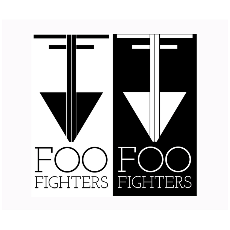
Icon & wordmark
Closing thoughts
The logo keeps with the theme of the band/genre of music, is scalable, works in black and white, and pairs a discrete icon and wordmark; however, the combination of icon and wordmark is a little long/wide and could do with more refinement.
Thanks for your time.