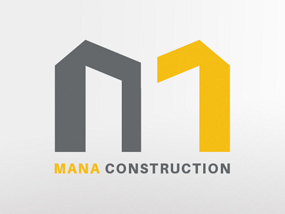
Logo Design for Mana Construction Company
I designed this logo for a construction company named Mana. Using the initial letter of the company's name, I created a monogram logo. In this case, M is the initial letter of the company's name. I designed the letter M to look like two buildings next to each other using two separate elements. For both elements, the inner corners are sharp and the outer edges are chamfered. Therefore, the elements together look like the letter M.
More by Maryam Sh View profile
Like
