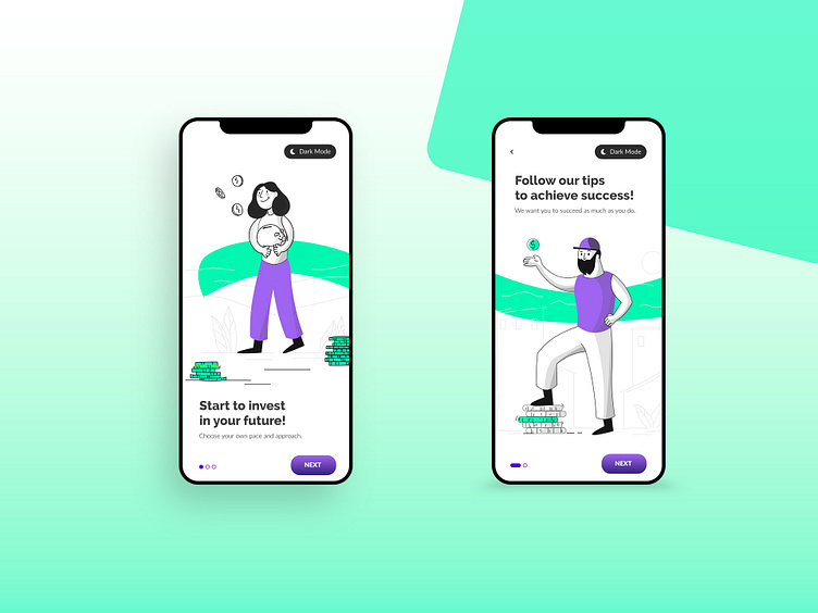
UI / UX Design for App Splash Screen
UI / UX Design to inform users (Investment App)
This splash screen contains a simple flow to inform first time users about the app. Taking the IOS Guidelines into consideration whilst designing was absolutely crucial, as all elements should be aligned properly and follow (among others) the Rule Of Thumb.
Role
Rick Bierman Designs was responsible for the User Interface Design, Illustrations, and UX Copy.
The problem
How to quickly introduce users to the app whilst lowering their bias that investing is difficult in a playful way?
The approach
Whilst Wireframing it became clear that the use of illustrations could be a fun and useful addition to the app. Both versions have been A/B tested to the target audience; one version with illustrations and one without. It became quite clear that the use of illustrations was prefered. However, many users complained about the lack of a dark screen option. Rick Bierman Designs added this Dark Mode option in the Splash Screens and 89% of users found this a great addition (can be switched on or off in settings later too).
The solution
The app was being developed until the company ran into other priorities in terms of cash deployment and its development is paused for now.
Services provided
UI / UX Design
User Flow
Mobile app Design
Content (Copy and Illustrations)
Rick Bierman Designs
Rick Bierman Designs supports clients in every stage of the process; from design to website launch. Save yourself the valuable time and money needed in looking for multiple experts; you have found your Design Powerhouse! Our job is to support you in the creation and evolution of your brand.
