Dentist Logo and Pattern Design
My dentist approached me with a request to make him a personal logo. I gladly took on this work, as I have never done branding for the medical field.
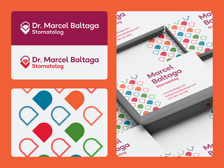
In this example, I moved away from stereotypes of using blue and green colors, and decided to break away from the imposed image of a "tooth" as a symbol. I wanted to create something that would not give an explicit understanding of the meaning and symbolism.
I chose colors that were radically opposite to what is commonly used in the medical field, which turned out to be slightly unsettling, but the effect of surprise works in this context. "The main thing is not to give color meaning" — I thought, and decided to use a different palette for the symbol, wordmark and for the pattern.
The pattern turned out to be symbolic, as it resembles motifs from Moldovan culture of knitting and embroidery. For me, it was important to preserve the culture and heritage of visual meaning. It also well intersects in meaning with the tourist brand of Moldova which has the headline "Discover routes of life."
