MAGPIES Logo Redesign

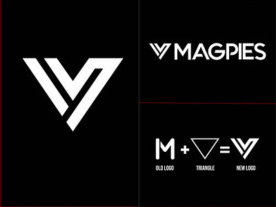
This redesign project was done for a teenage sports team, who wanted to make their old logo stand out from the crowd and look bold, sharp and energetic. I took their old logo and made it fit in a triangle. Oh, I forgot to mention, they were an urban Parkour team. And yes, let me know your thoughts or gut feelings about this project in the comments!
-
Need a brand identity/logo for your business? Let's get in touch!
Mail: [email protected] |WhatsApp | Telegram