Lingerie store redesign
/ 3
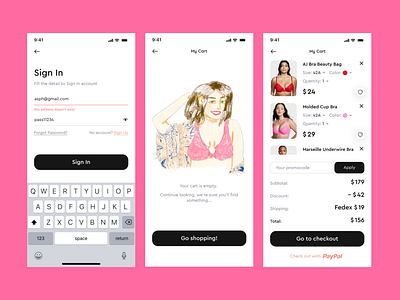
Here are some screens of the mobile version. They are not related, but the idea of this shot was to show that this project was worked out from all sides 👩💻
Detailed registration and login. There is not even much to say here, since this is a basic thing in website design.
I've also incorporated playful illustrations in "empty" areas, such as the cart and favorites, to add a touch of personality to the design.
A lot of attention has been paid to the shopping cart, especially in the mobile version. Users can change the desired size, quantity and color of the product in a couple of clicks, as well as delete or add to favorites if they suddenly change their mind about buying the product now, but want to buy it in the future.
For added convenience, i've also included a quick checkout option using PayPal, allowing for a faster and smoother purchasing experience. All in all, i've put in the effort to make sure that every aspect of the mobile design is thoughtfully crafted for the best user experience.
Thanks for your attention! 🧡
