Walkies - 404 Page
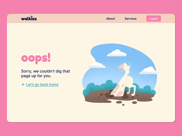
When I saw this challenge I knew it was the perfect way to showcase my combined design and illustration skills (and gave me an excuse to draw a cute dog butt).
When designing 404 pages, I think it's important to reassure the user (in this case with a friendly message and graphic) and give them a clear way to get back to the main website or application. This is why I dislike including the literal text "404" on a page like this - errors are scary to users, and just because you as a designer or a developer know what a 404 error indicates, that doesn't mean that your average user does.
Rather than opt for a literal "404" text, I've included friendly language that is human readable, indicating that the page wasn't found, while including a dog-based pun that complements my illustration on the right. As well as avoiding confusion, it's important to not place the blame on the user by saying something like "you typed in the wrong URL" - it's on us as designers and developers to look after our users in the best way possible.
Finally, including a simple link back to the home page gives the user an easy way to get back to a working part of the website with minimal confusion and frustration.
Illustration
I wanted to create a custom illustration for this design to really complement the purpose of the site (dog-walking services) and include something that users who love their pups would appreciate. By including this, we further support the dog-based pun of "digging up a page". I designed and illustrated this image in Procreate with the Apple Pencil and iPad Pro.


