Commander's Palace Logo Refinement
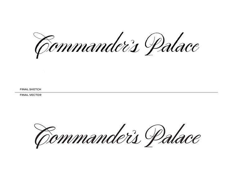
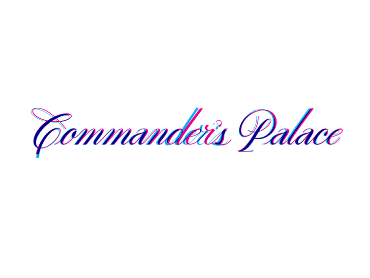
Late last year Ashlee Arceneaux reach out to have me help do final production on this incredible hand-drawn logotype. As you can see in the image below, there isn't a huge difference in the her final sketch (blue) and final vectored logo (pink). I mainly focused on letter spacing and consistency in shapes/letters.
It's always an honor to work with other designers and these are some of my favorite types of projects.