Gigs branding and landing page

Gigs is a telecom startup providing B2B and B2C whitelabel mobile subscription services. This is the first iteration round of the branding and landing page refresh, which was my job. Although this version was not ultimately chosen, but a later layout direction (which I will present in another project), it is still a consistent version that I consider to be good.
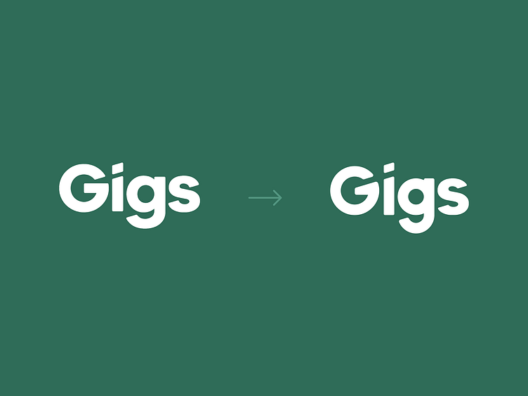
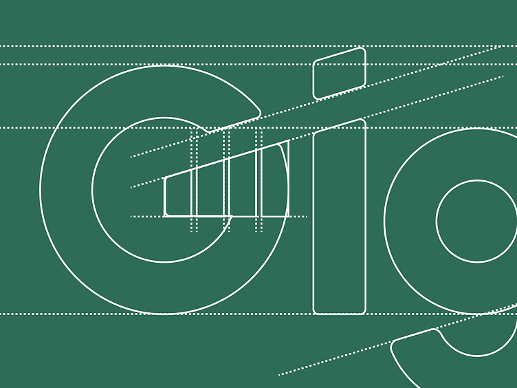
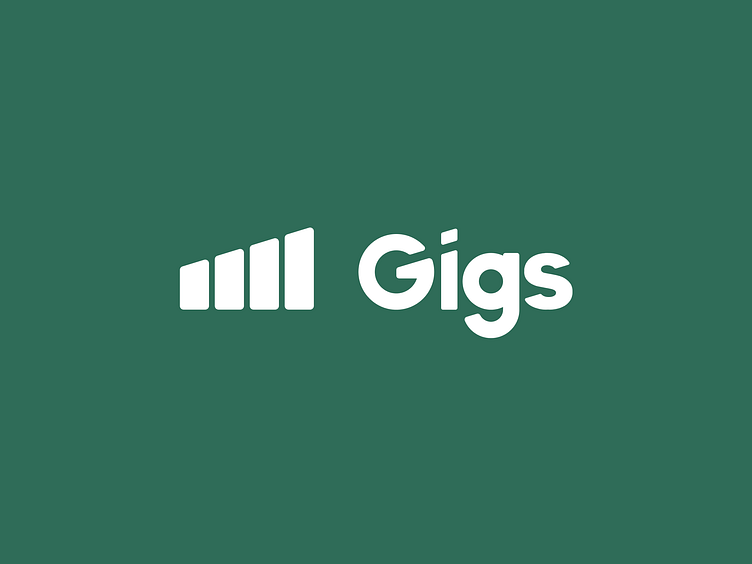
Uplifting the logo
Gigs is short for Gigabytes and refers to the amount of mobile data available. With minimal changes to the original logo, I built the concept by changing the shape of the G and adding the data connection stripes as a brand element in line with it, and using this shape as a symbol for other visual representations of the brand.
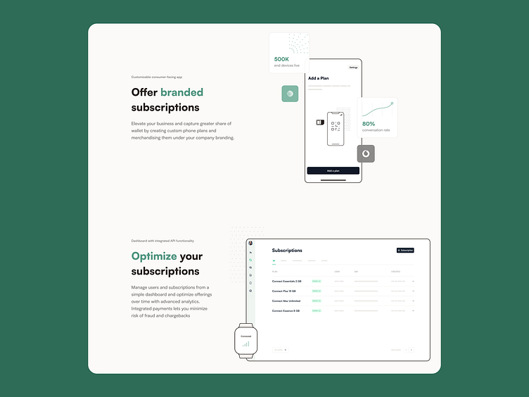
Building a landing page
When designing the landing page, I aimed for minimalism and structured information transfer, using simple elements and lines, the same style as in the whitelabel user facing application.
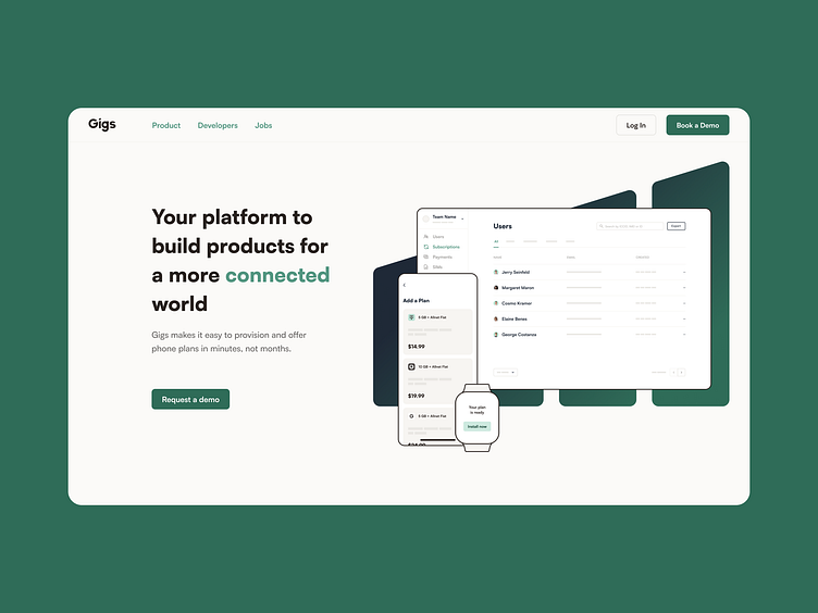
Although this version was discarded, it proved to be a good starting point for the next version, which I will present in another project.