Portal for agency clients to track real-time project hours


Project
Exploration for a customer portal to track hours spend on a project. The information will be imported from the agency's internal time tracking tool. This tool is used by employees to track their hours on a project. This project was to make (part of) that data available for the clients.
Goals
The client should be able to see a real-time overview of the scoped hours, written hours and planned hours of a project.
Transparency: by making data available for the clients to see, we will gain trust in our clients. Next to that, the portal will make it immediately clear to the client when the scoped time is exceeded.
Efficiency: client's will no longer have to request time from a project manager to go through the hours.
Role
UX/UI Designer
Team
UX/UI Designer
CTO (for technical insights)
1. User Stories
First, we mapped out the user stories in FigJam. This helps to keep track of the user flows and what functionality is essential for this portal. Since, there was not a huge amount of time for this project, we needed to make sure we didn't make it too complex and add in functionality that wouldn't be used by the clients.

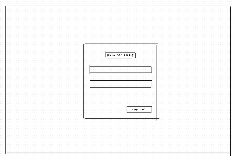
2. Quick sketches
Above we mapped out three main screens: login, project overview, and project detail view. To quickly visualize a rough idea of the layouts for these main screens, I created some sketches.

3. Wireframes
With a rough idea in mind, it's time to jump into Figma and translate these sketches into wireframes. The idea here is to add a little more detail and come up with some more detailed visualizations that we can use for the design.

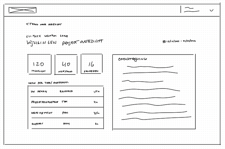
4. Exploration
I like to start with a clear mind and see what I can come up with myself in terms of layout. For example, I explored a couple different versions of visualizing the project hours (image below).
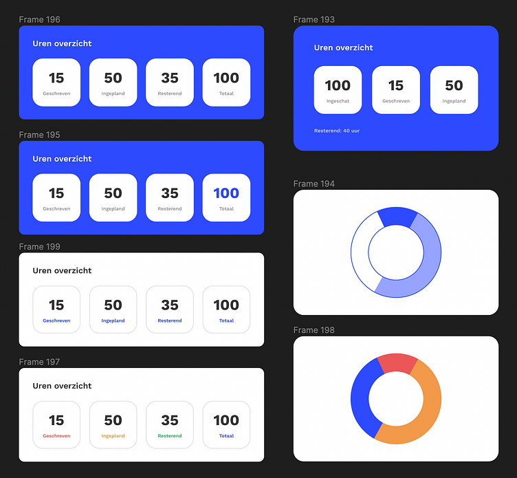
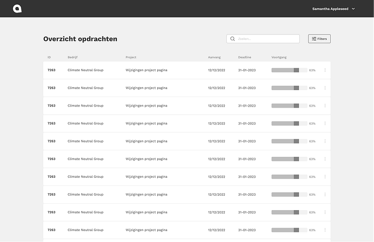
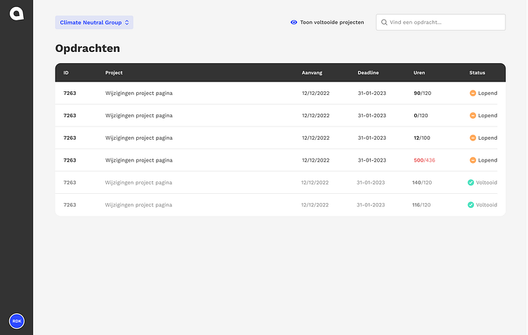
For the project overview, I initially started with a table layout. But after discussing this with the CTO (who was working on this project with me), we decided that a table would not be the right visualization because there would never be more than a handful of projects per client.
The table layout would be much more suitable for the Archive screen. In the archive we would show all the projects that are finished, which could be a lot of projects that would build up over the years.
Below you can see a few explorations of that table layout we initially envisioned.


For the project detail view, II was mainly looking into the best way to visualize the hour overview, since this was the most important part of the portal. Below, you can find two more explorations.


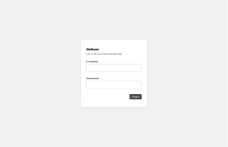
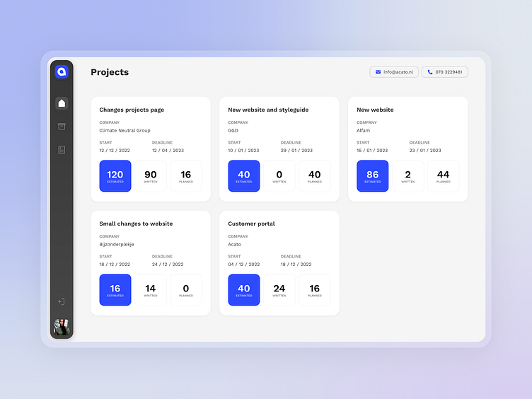
5. Design
After a lot of exploration (even more than I have shown), I narrowed it down to a final design. After lots of explorations for the navigation, I decided that a left-side bar would leave the most space for the content (since his would be desktop only). the style I went for is very modern and 'modular' as I like to all it. You can see that the pages are made up of different sized blocks, as well as the sidebar. his gives the screens a lighter look.

6. Prototyping
Interaction is just as important as visual design, and I love working with motion and interaction to make a static screen come alive and make the flow a bit clearer for the user.