Blunt- Fashion E-Commerce Store
🙋 Hello Creatives! 🙋♀️
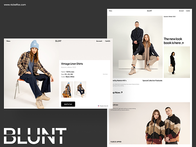
This design depicts an e-commerce fashion store with a sleek, modern design. The layout makes use of a lot of white space, giving the design a clean and uncluttered look. The use of white space creates a sense of luxury and exclusivity, making the clothing and accessories on display stand out. The aesthetics of the design are minimal and sophisticated, with a focus on simplicity and elegance. The typography is also modern and understated, adding to the overall chic and upscale feel of the website. The color palette is subdued, with cool tones of gray and white. All this creating a sense of elegance, exclusivity and luxury. I hope you like it. !! ✨
--------------------------------------------------------------
For Freebie Click Here
--------------------------------------------------------------
Have an idea? Let's talk here or WhatsApp
Follow us here:
Colors
(Black Enough) #050505- used as a Headings and Accent text
(Light Beige )#F4F0ED- used as a BG
(Blackish Grey) #7A7A7A- used as sub text, paragraph
(Grey's First Cousin) #B7B7B7- used as some sub-texts
(Good ol' White) #FFFFFF- used as a BG colour
Fonts
Plus Jakarta Sans |Regular, Medium, Bold | Used for Headings, Body Text, and Accents
Asset Link or credits
Figma and Unsplash 🙌🏼
Techniques
1. Minimal Design
2. Typography
3. Modern Touch
4. Grid System
Our designer says
This design showcases clean and intuitive UI design for a Luxury or Bespoke fashion brand. The UI is simple and premium, it follow the less is more principle and only displays the essentials beautifully placed on a brutal grid system providing structure and unmatched aesthetics to the design. Thanks :)


