KORC Photography Logo & Exploration

A Chicago-based photographer asked me to create a logo for her new business called KORC Photography. As I began working on this project, I was overwhelmed with a variety of ideas, inspired by simple obvious visuals, like stylized cameras and photography elements, and also inspired by the relationship of the letter "K" and the letter "C".
Logo Mark Exploration
I wasn't given specific direction for this logo, so I had to improvise, and follow my instincts for what might make sense for a younger active female photographer in Chicago. One idea slowly evolved to another idea, which then evolved into another idea, and so on... before I knew it, I had crafted dozens of different marks, and the variety was very interesting to me. Some of the ideas were definitely stronger than others, but what I find valuable is the commitment to try a handful of different ideas.
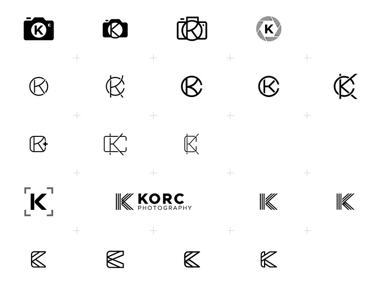
In my exploration, I wanted to try some logo mark ideas that were more obvious, and would be clear to others that this logo was created for a photographer. Additionally, I wanted to try some logo mark ideas that were less obvious, and perhaps more creative, artsy, etc... and then I could indicate that this logo was for a photographer simply with the logotype.
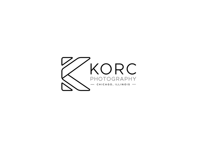
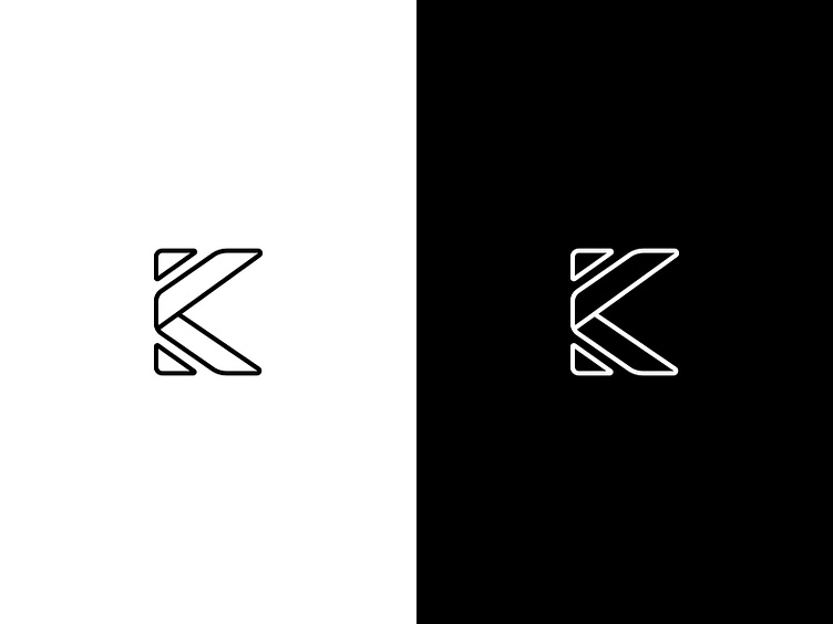
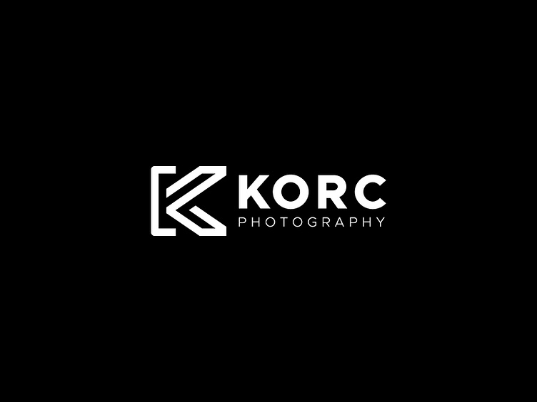
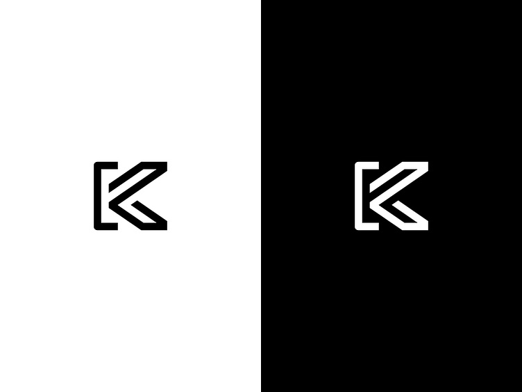
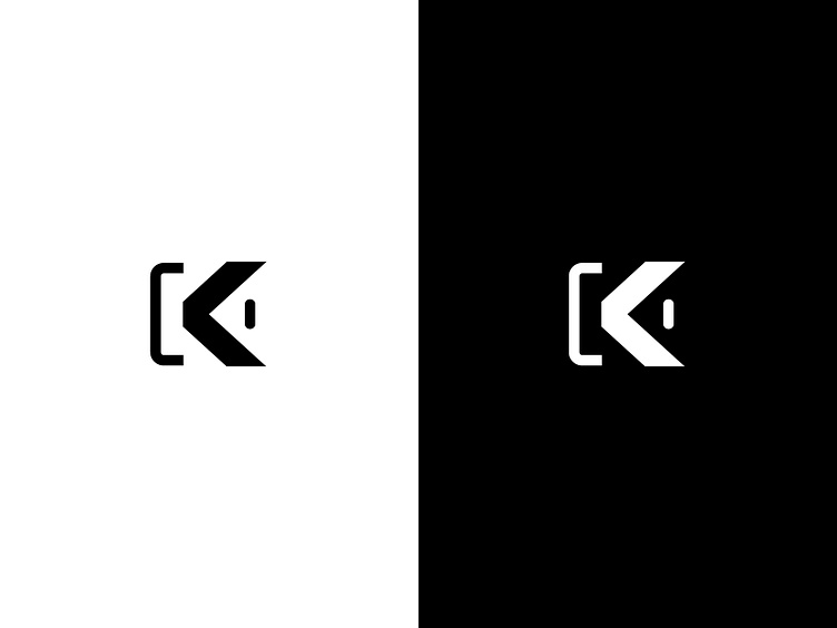
Abstracted KC Concept
After a thorough exploration, I noticed that several marks were stronger than some others, for example, this one that I've dubbed "Abstracted KC", and it contains a combination of the "C" letterform with the stylized legs of the "K" letterform.
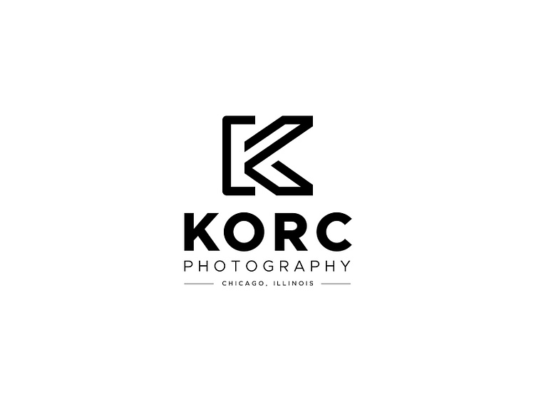
There's a particular strength to this mark that works nicely on white and reversed-out on black.
Abstracted KC 2.0 Concept
This concept was an evolution of the previous "Abstracted KC", and contains some more stylized graphic elements that allude to an eyeball and also to a camera, as well as utilizing some graphic elements that are familiar to the letter "C" and the letter "K".
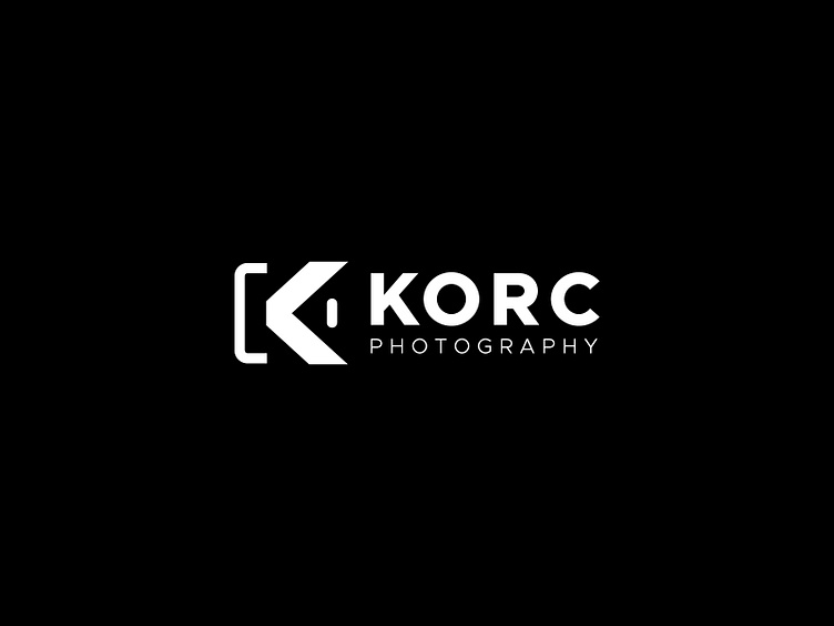
Above, I wanted to try the logo on a black background, and also try repositioning the logotype to the right of the mark itself.
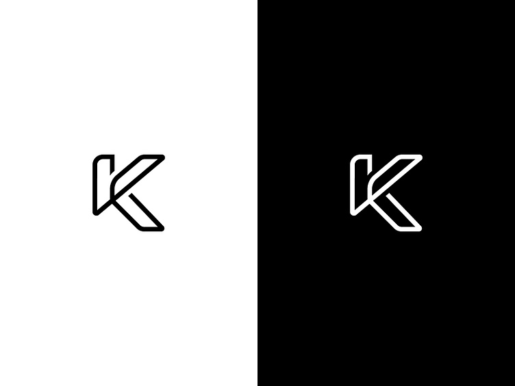
Continuous Line Concept
This concept is another take on a stylized combination of the "K" and the "C". I really enjoyed that there was a beginning and an end of within this mark, it felt as if the whole mark was drawn in one continuous line. I also really enjoyed the weight of the mark, there is a certain amount of strength that I feel is appropriate for this concept.


Lightweight Concept
This is a slightly different take on the "K" and "C" letterforms, with a stylized way to visualize the "C" as a ribbon that slightly bends. As I was fleshing this concept out, I began to notice that the mark also looks like the figure of a person, which was kind of a happy mistake, but one that I've embraced.