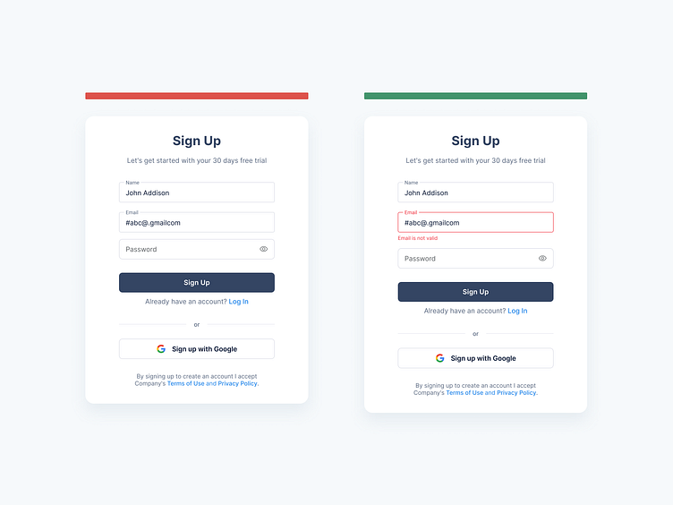
Sign-up Forms: input validation
Hey Dribbblers 🏀,
Instant input validation is a way to increase the usability of your sign-up and login pages. The users do not have to wait to submit the form to see any errors that need their attention. Instant validation helps them easily relate the feedback with the input they have just provided and they can correct it in no time. Rather than waiting for the user to fill out the entire form before you point out any errors, let them know as soon as your system can tell there’s an error. There are a few important factors to remember while providing a useful instant validation. Display the message only when the user just left the input field. A positive error message helps the user build their trust in your product. Also, the error message should explain well about the problem and how to resolve it.
Read more about case study on Medium:
https://medium.com/ux-planet/10-best-practices-for-creating-sign-up-forms-48470ce94b16
Don't forget to press "L" if you enjoy watching this ❤️.
Thanks for checking it out!
If you have comments, let me know!
Say hello at 📧
Visit my Website 🌎
dmitrysergushkin.com
For more inspiration, visit my profiles ✨
