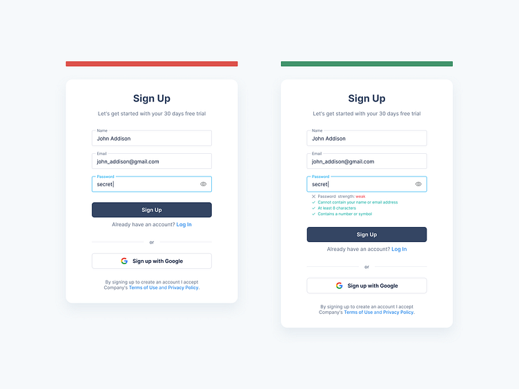
Sign-up Forms: Users need to know password requirements.
Hey Dribbblers 🏀,
Never presume that users are aware of strong password rules. Require passwords near the control so that users can see them. Do not hide the password requirements in the default view; only display them when the user enters a weak password. In addition to wasting the users’ time, this will also decrease their trust in your product.
Password entry can appear simple on the surface, but there are several things to consider for good UX. Namely, should you show or mask the password when the user types it in? On one hand, letting them see it will prevent typos, failed logins, and frustration. On the other, users may not want their passwords on display if they’re using a computer in public. The consensus seems to be this: Mask the password field by default, but allow users to show the inputted text if they want to.
Read more about case study on Medium:
https://medium.com/ux-planet/10-best-practices-for-creating-sign-up-forms-48470ce94b16
Don't forget to press "L" if you enjoy watching this ❤️.
—