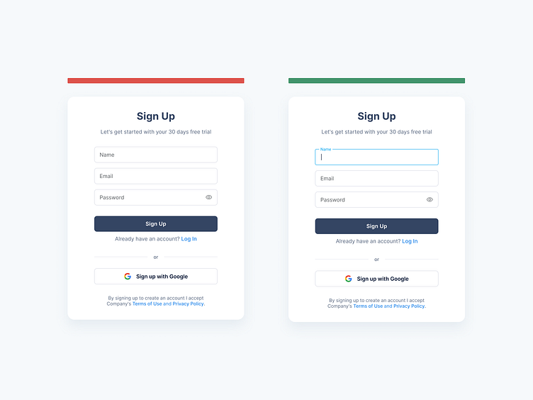
Sign-up Forms: Autofocus on the first field
Hey Dribbblers 🏀,
Chances are that most of the people accessing your registration form will quickly click on the first input. The trick is to forestall some troubles for them and auto-focus on the field.
Automatically activate the first field (or the needed one) in the form. In that way, you give a hint to a user where he should start and as a result, significantly boost the whole process. Moreover, you save a respondent from one additional click/tap and a bunch of unwanted speculations. A good practice is autofocusing the first input. Make it clear where the login area is. If the user has to search for the login area, they’ll be frustrated and less likely to sign up. Not only in sign-up forms but in most other forms too.
Read more about case study on Medium:
10 Best Practices for Creating Sign-up Forms
Don't forget to press "L" if you enjoy watching this ❤️.
—
