ReFit Academy: Naming + Brand Identity

Objective
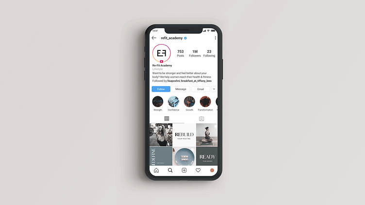
During the pandemic, Lisa, fitness leader and personal trainer, shifted her business model from a brick-and-mortar gym to an online fitness community and one-on-one personal training.
To transition her business and her clientele, we strategized with her to create a name from which a new brand foundation could be built upon. We then designed an identity system to help her get started building her new business.
Deliverables
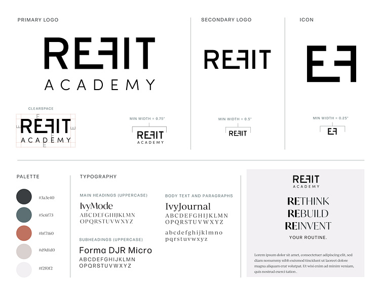
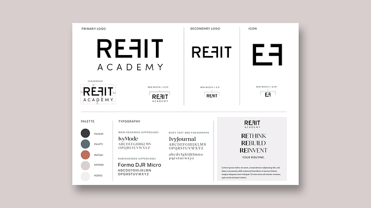
— Logo Design
— Identity System
— Naming
Details
Nailing down a name
Re-Fit Academy helps women rebuild their bodies and their confidence through fitness and nutrition by teaching them how to exercise, and eat smartly and mindfully. As a result, the idea for the name came from juxtaposing the words rebuild and fitness.
Even though there were hundreds of other name ideas, we landed on Re-Fit because it offered a lot of options for building a library of branded language that could be used to create memorable campaigns and distinct messaging.

Designing a fitting logo
The logo concept is based on the literal idea of refitting pieces together to transform into something new. The F has been purposefully reversed to face the E, and both letters have been customized to fit tightly as if they were pushed together. Because of the space between them, a viewer would curiously try to imagine what the resulting shape would look like if the letters were put together, and that’s part of what Re-Fit Academy can do for women looking to transform their bodies; help them to visualize their results and then reach them.