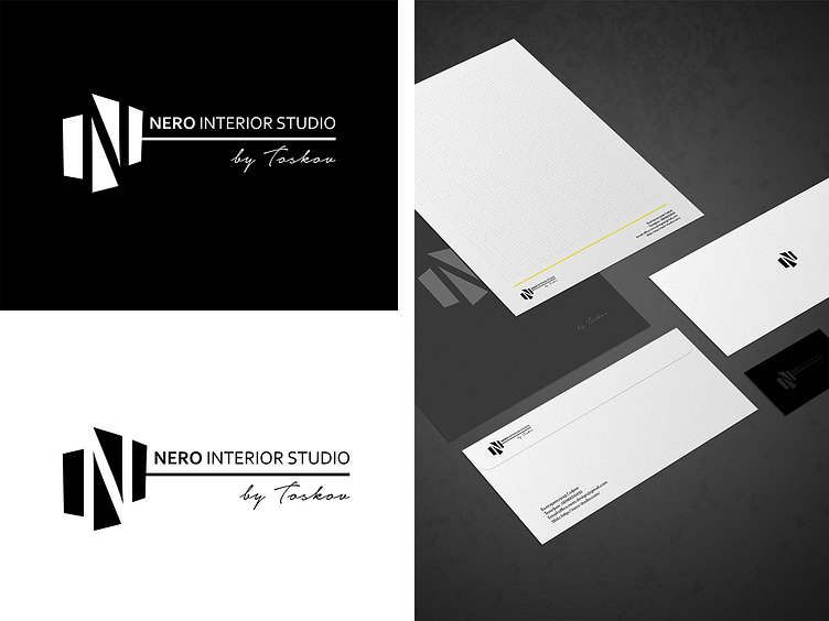
Nero Interior Studio logo design
I want to kickstart the year with some of my best logo design works since I started my career.
The Nero Interior Studio logo came from simply visualizing two walls, the letter N, and interior materials.
A logo design should, and it is simple, the problem is that sometimes people overcomplicate things, and the logo needs to convey the real purpose of the business, to put it simply, complex symbols create friction, think of apple or google.Keep it simple and avoid adding too many details or elements, this is my formula for a good logo design.