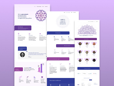
Website redesign project for a leading Indian Philanthropy Team
The team wanted a clean design with the pre-defined color palette and typeface. They mentioned wanting an Indian feel to it. Hence the use of intricate mandalas.
The previous website had an information overload. So we played around with timelines, metrics, 3D graphs to showcase that information in a better way.
More by Manali View profile
Like
