Hello Norden

🏴 Rebranding for a small interior & architectural design brand out of Saint Paul, Minnesota.
The client, Kassina, felt that Hello Norden’s existing logo was in disconnect from the brand’s identity and that it didn’t sufficiently convey brand character.
💡 She envisioned a logo that combines Dada, vintage apothecary, and rock & roll influences. The goal was to communicate that HN is an unconventional brand that offers high-quality heirloom goods that are luxurious without pretension.
We created an intricate vintage emblem inspired by Art Nouveau & the Arts and Crafts movement, but with an edgy/biker twist.
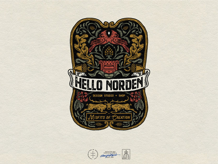
🌲 The central element is a traditional chesterfield sofa. Above it are two Norther Cardinal birds, and below two deers clashing. For the botanical elements, we decided on oak leaves, pine cones & needles, and a flower reminiscent of those in William Moriss's patterns.
The color palette is based around dark, but warm and muted fall tones. For the type, we chose a bold, distressed display font and paired it with a hand-drawn script and a typewriter-style font.
⚙️ Once the main logo was finalized, we created secondary and tertiary marks - both circular emblems, as well as tons of submarks, wordmarks, and monograms that can be used interchangeably, depending on the context.
Later we moved on to creating a flexible label & tag design system, brand patterns, and social media visuals - avatars, banners, and post templates - to support the brand’s digital presence.
💫 To finalize the project, I created an extensive brand guide that will help the brand keep visual consistency while giving it enough wiggle room to never have to be repetitive.
Follow me for daily design inspiration! ⭐️