Tinloof Store: Case study
We built an online shop for Tinloof's merchandise to showcase the power of headless Shopify integrated with Sanity.
Branding
The store's brand language is an extension of Tinloof's brand guidelines. We simply added a few more grey colors and guidelines for the photography.
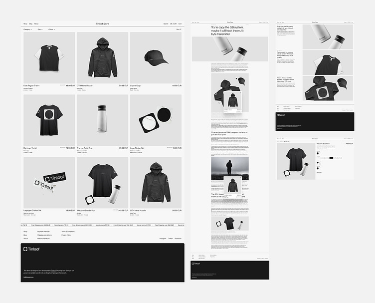
The store follows a minimalist design to optimize the user experience and highlight merchandise photography. In the same spirit, the logotype is a simple extension of Tinloof's logo.
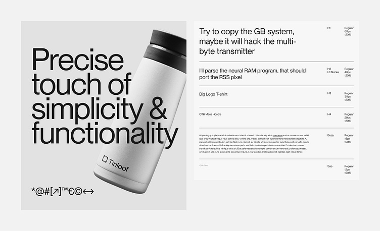
Typography
Similarly to Tinloof's website, the store uses PP Neue Montreal font. The Sans font is easy to read, simple and looks great as a display font for headings.
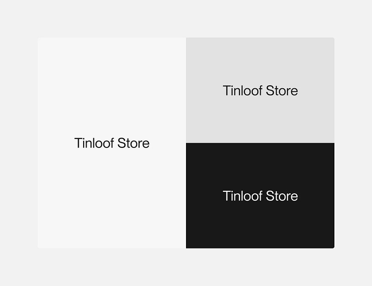
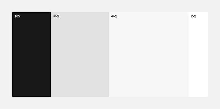
Color scheme
The store mostly uses light colors, including white and light shades of grey. Black is mainly used for text and primary elements of the website.
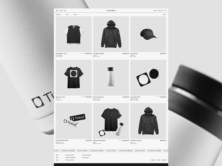
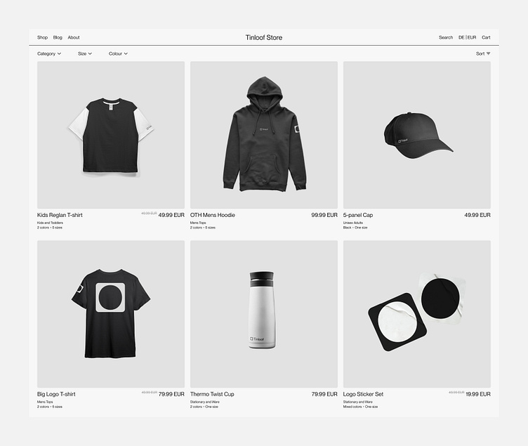
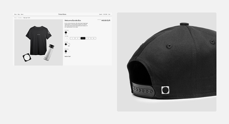
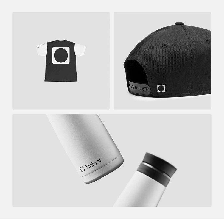
Visuals
The store's visuals consist of photography of the various merchandise products. The photography matches Tinloof's brand guidelines and uses Platinum as a background to highlight items.
Design mockups
The store is minimalist and the UI concept couldn't be more straightforward, so we were able to save some time by combining the wireframing and UI design.
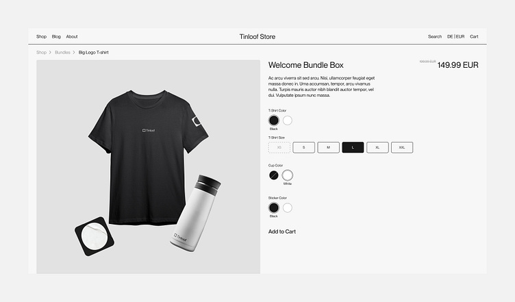
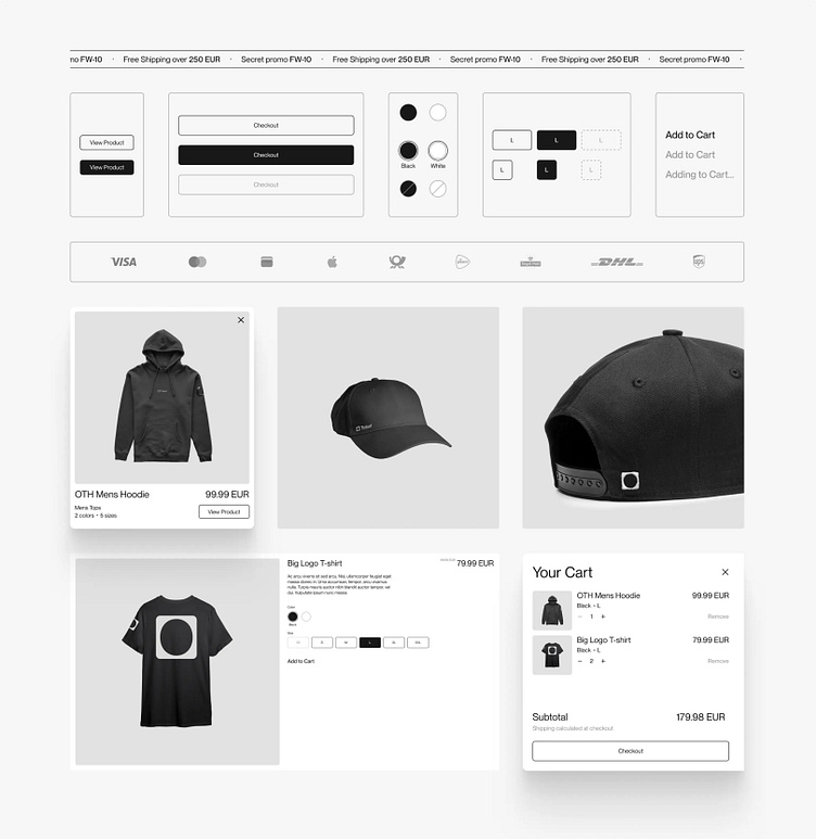
UI Kit
The UI kit consists of reusable UI elements, including components such as the buttons, the cart, and the various displays of products.The goal of the kit is to ensure consistency across the store, facilitate the development by having reusable elements, and document the different states of the elements.