Case study research: Sidebar Navigation


Overview
Sidebar navigations are rapidly becoming more popular (especially with SaaS products) thanks to the way that they enable designers to utilize layout space better. Navigation menus are vital to user experience and interface design. Most benefits of this navigation UI derive from its ability to accommodate many top-tier categories.
Purpose
Creating a clean and user-friendly sidebar design that met SaaS product requirements, help the user quickly and comfortably use the navigation tool to find the workspace they needed. Sidebar research and design take into account the current experience and research results of sidebars in interface design.
Challenges
1. Accessing Deeper Pages. As the product grows, the number of pages and workspaces increases and the user has difficulty finding the right page. It was necessary to provide a user-friendly hierarchy for navigating through the product pages.
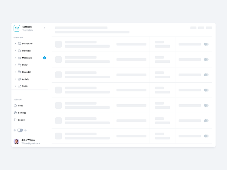
2. Visual scanning of the navigation. The sidebar should be visible to the user, including the main pages for navigation. Apply user-friendly iconography that displays the essence of the content and the functionality.
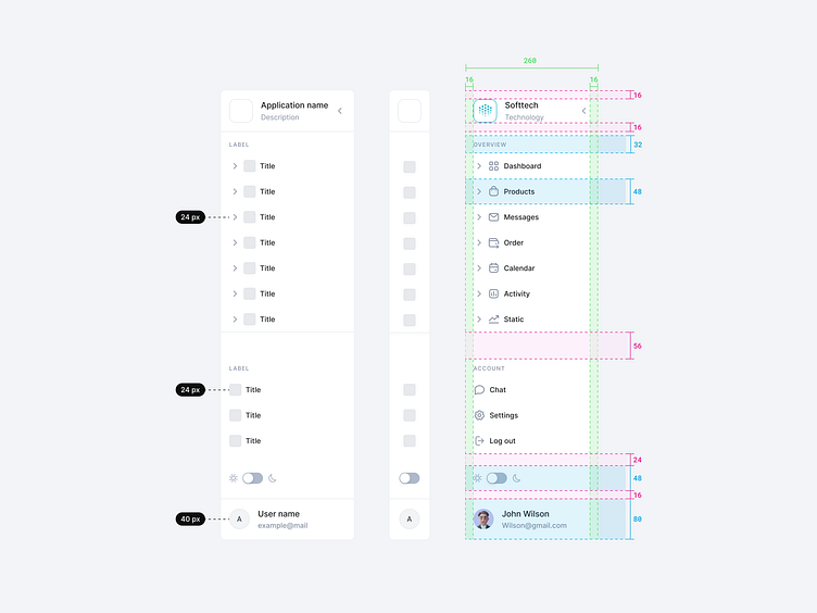
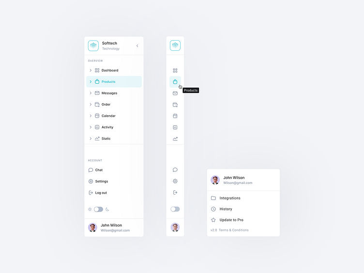
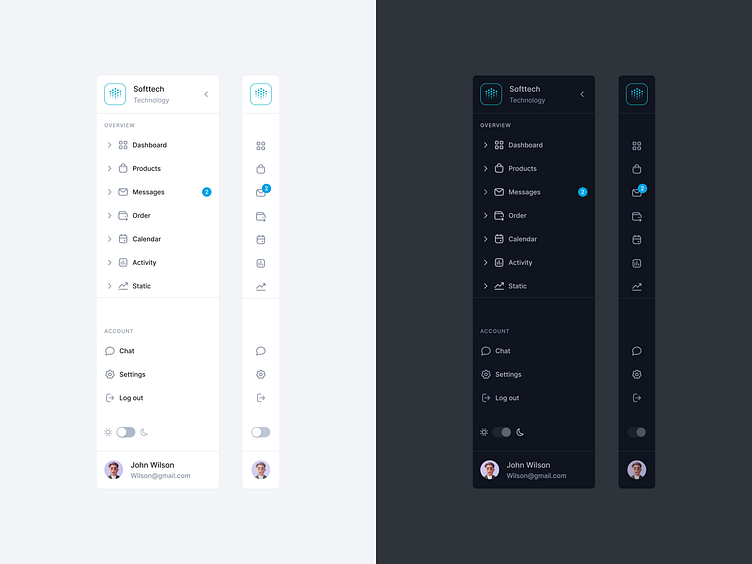
3. Compact and collapsible. For user convenience, it was necessary to provide the ability to minimize the sidebar to enlarge the displayed information on the main screen and place an element on the sidebar, which is responsible for this function.
4. Brand Identity. A company logo needed to be placed in the sidebar to represent the company's branding and serve as additional navigation to navigate to the main product page.
5. Workspace separation. It was necessary to provide a separation of management items and the main pages of the product for convenient user work with the sidebar.
6. Dark mode for the user interface. Create a black mode design for the sidebar to ensure comfortable viewing conditions and readability.
7. Place the user's avatar, name, and email in the sidebar. For convenient management of the user account, it was necessary to provide a point to enter the settings and change the user account.
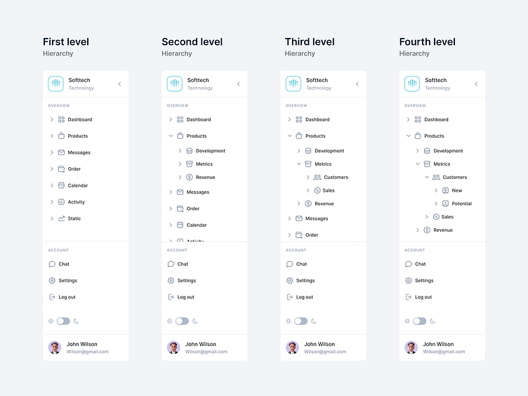
Hierarchy of items
A hierarchy was designed for menu items in the sidebar in the form of a drop-down list, this will help in the future in terms of product growth and the addition of new pages to use this space. The four-level list has been divided into thematic groups, which will help the user quickly navigate the list. In the process of researching was study the experience of navigation in such products as Slaсk, Notion, Figma, Spark.
Behavior
For user convenience, there is an option to collapse the sidebar, which allows users to conveniently use the space of the main screen. It was also decided not to use a contrasting background for the sidebar, so as not to distract the attention of users.


Light vs Dark
The dark background provides a comfortable perception of information in the dark time of day. One of the arguments in favor of the dark theme is that the target audience likes it. Users want to look at the familiar interface or from another angle. This will only work if the look is updated without a major change in structure.
Factors that influence the choice of mode:
1. Readability. The criterion is responsible for the ease of perception of the information from the screen of the device.
2. Accessibility. Ability implies equal accessibility for all segments of the target audience. Analytical studies confirm that the color scheme affects users differently depending on age, previous experience and other parameters.
3. Responsiveness. Content should be displayed in its entirety on all devices, from computers to tablets. If a dark theme reduces informativeness and it is critical for users.
Read more about case study on Medium:
https://medium.com/ux-planet/case-study-research-sidebar-navigation-b41272026c6d
Thanks for checking it out!
If you have comments, let me know!
Say hello at 📧
[email protected]
Visit my Website 🌎
dmitrysergushkin.com
For more inspiration, visit my profiles ✨