Sonof
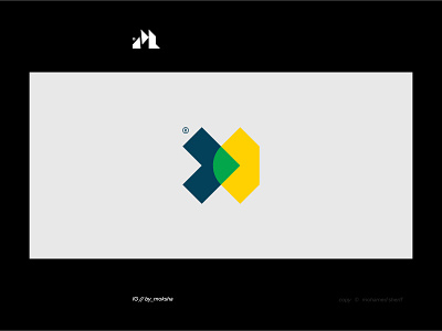
C.CT: Letter (S) - arrow - geometric shapes, I used part of the letter, not the entire letter, in order to be easy to mix it with the rest of the ideas.
The arrow appears in a rather new way and expresses that the (sonof) is the right choice because in most cases the right sign is used as the right way.
The geometric shapes here play a very important role, which is that the entire logo is based on more than one shape, such as the circle, triangle, square, and rectangle, and this has a very important significance for the Brand, which is the diversity in services and ease of adaptation to any situation.
More by Mohamed Sherif View profile
Like
