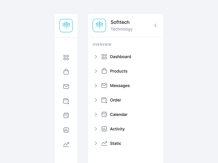
Sidebar User Interface

Hey Dribbblers 🏀,
Specific categories increase findability and decrease interaction cost.
Using vertical navigation removes the visual design constraints that limit the number of categories, allowing the team to create an IA that naturally fits the information space, and expose specific, high-information categories to users without requiring them to dig into the second tier of the hierarchy.
Read more about case study on Medium:
https://medium.com/ux-planet/case-study-research-sidebar-navigation-b41272026c6d
Don't forget to press "L" if you enjoy watching this ❤️.
Thanks for checking it out!
If you have comments, let me know!
Say hello at 📧
[email protected]
Visit my Website 🌎
dmitrysergushkin.com
For more inspiration, visit my profiles ✨