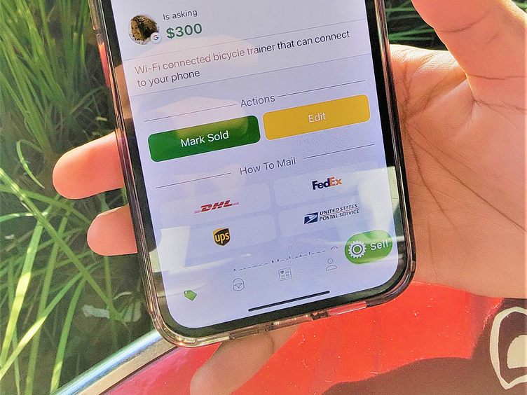
Sprocket iOS Tab Bar w Bigger FAB (WIP)
Repurposed this rebounded Android concept for iOS where during testing I found customers had a hard time finding the buy button due to its smaller optical size than Android. Instead of having the FAB centered ( as today in the App Store ) I moved it to the same position as on Android - so that the tap area for each of the tab buttons could be reduced on the other side! I dont have a screenshot of this as the TestFlight build keeps crashing after I took this 😓
Note: this is an actual implementation photo not a mockup
If you like it, don't hesitate to click "L" 💗 or "F".
More by Retrographic View profile
Like

