Book Store
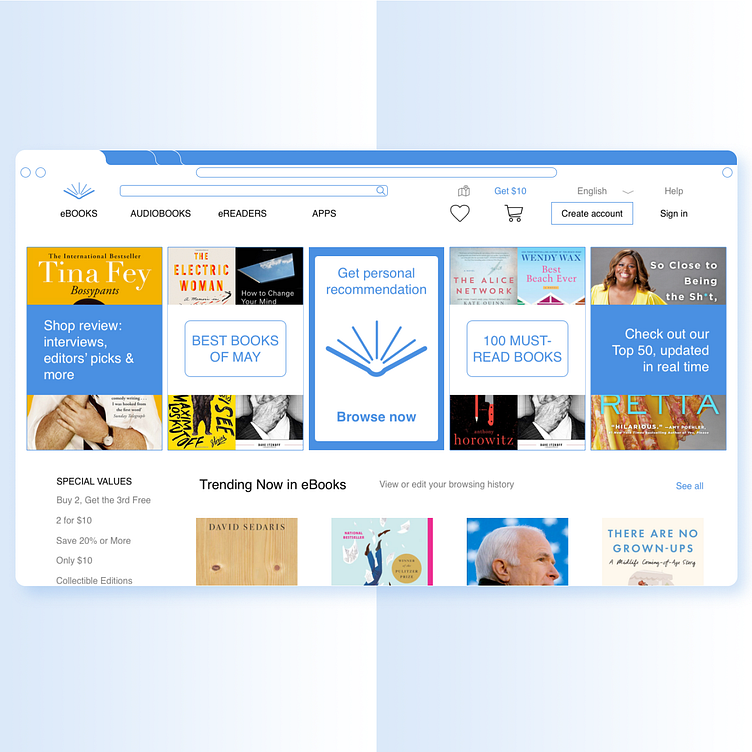
The goal was to make the selling site look like a real one. With various types of advertising and eye-catching details.
The color was chosen blue so that with a large amount of content the user does not get tired, but rather deepens into the site.
I tried to make the interface easy but with an emphasis on selling details.
This is my educational project. Thank you.
More by Yauheni Damantsevich View profile
Like


