Cloudaware
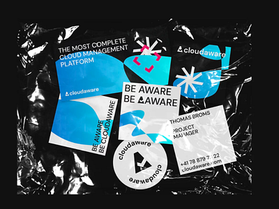
We’ve developed a revamped style of an IT company specializing in working with cloud infrastructures.
About the client
Cloudaware is a manufacturer of enterprise SaaS (software as a service). The platform collects cloud storages of companies with all data and analytics in a convenient place for customers — Cloudaware CMDB (Configuration Management Database).
Task
Our task is to refresh the logo and develop a modern corporate identity that will distinguish the company in the market.
Solution
While updating the logo, we focused on the sign, separating it from the font part. The sign itself has been simplified, now it is easier to use it on different media.
The letters in the logo were made lowercase — this technique allows you to reduce the distance between users and the service, building up a sense of trust in the brand.
The signature colors are black, white and shades of blue. It’s a great combination of contrasts and accents. The DM Sans typeface was used for typography — everything is smooth and easy to read from any kind of media.
The variability in the design was important to Cloudaware, so we developed not one, but several patterns based on rays of stars, ticks from the logo and abstract shapes with a gradient.
