Icons Project
by Fabien Jouin and Patrick Mariathasan
Our icons are designed for functional use in our products.
They appear in bold, simplified pictogram style that feature primary geometric shapes and bring clarity to their subject. Our icons reduce forms to a flat view and incorporate cuts and angles taken from the functional illustrations and our font.
Support the brand
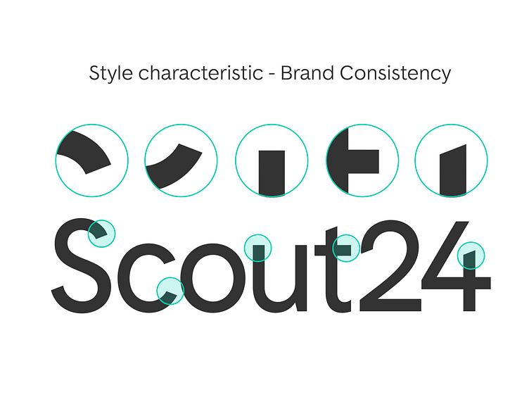
Our icons share stylistic attributes with our logo and functional illustrations. The outcome is a very characteristic style and connects our icons to other branding elements, while keeping their simplicity and informative purpose.
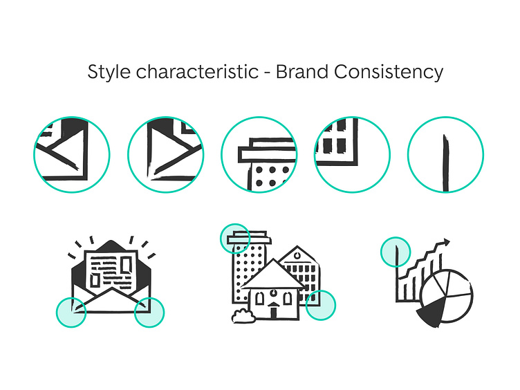
3 types of stroke terminal
We defined two stroke terminal types that share the same visual language with our custom font used in our logo, to keep a strong relationship between icons and logo. A third type of stroke terminal was added to keep balance between icon’s elements.
Style characteristic - Stroke Width
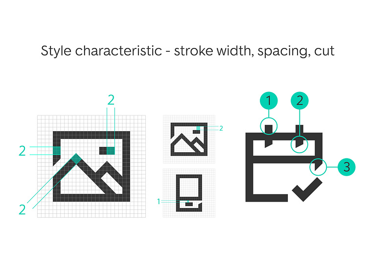
All icons (24px and 48px) use a consistent stroke width of 2pt.
The distance between elements should be minimumof 1pt and preferably be of 2pt.
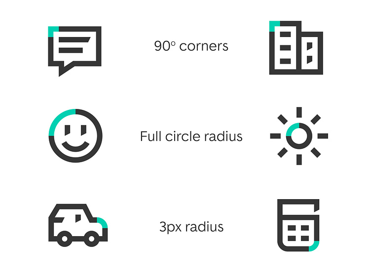
Style characteristic - Corners
Sharp 90° corners should be used at default to give our icons their distinctive and brand coherent look. But of course to improve understanding, and make shapes recognizable, 3px radius or full circle radius can be apply to some icon’s part